One Room Challenge | Week Eight | Home Office Reveal

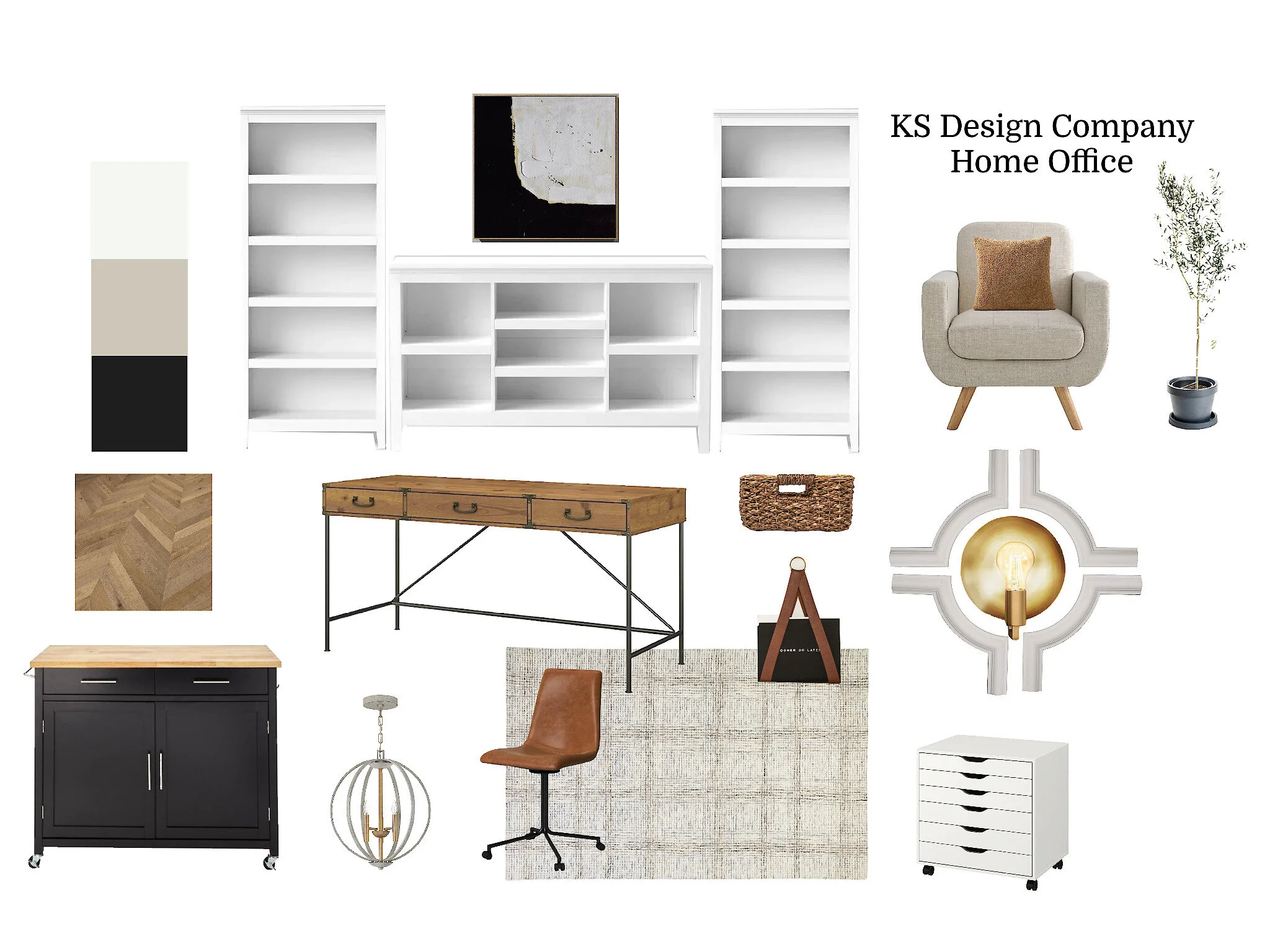
The home office transformation is in the books. 💪🔨🥳Over the last eight weeks, the home office went from a catch-all office meant for personal use to an organized, upgraded home business office! This One Room Challenge journey has been a little bumpier than past years. This project being trickier to document paired with a personally hectic fall meant that we only blogged six out of the eight weeks. 😬In the end though, we love this project just as much as the others. Cheers to a functional, beautiful space where we can meet with clients. 🥂

If you are new to KS Design Company, welcome! We are a mother-daughter design team working in the Topeka and Kansas City metro. We started KS Design Company a few years ago and love working together! In past rounds of ORC we have designed a living room, a sunroom, and a basement bathroom.

Take a look at how the home office came together:
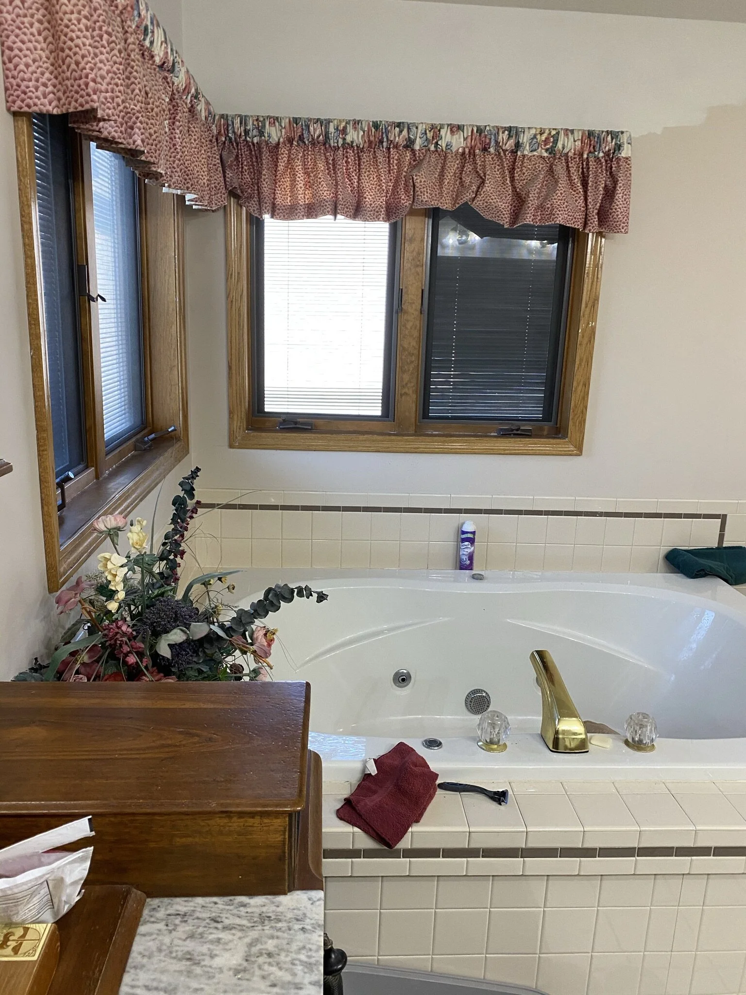
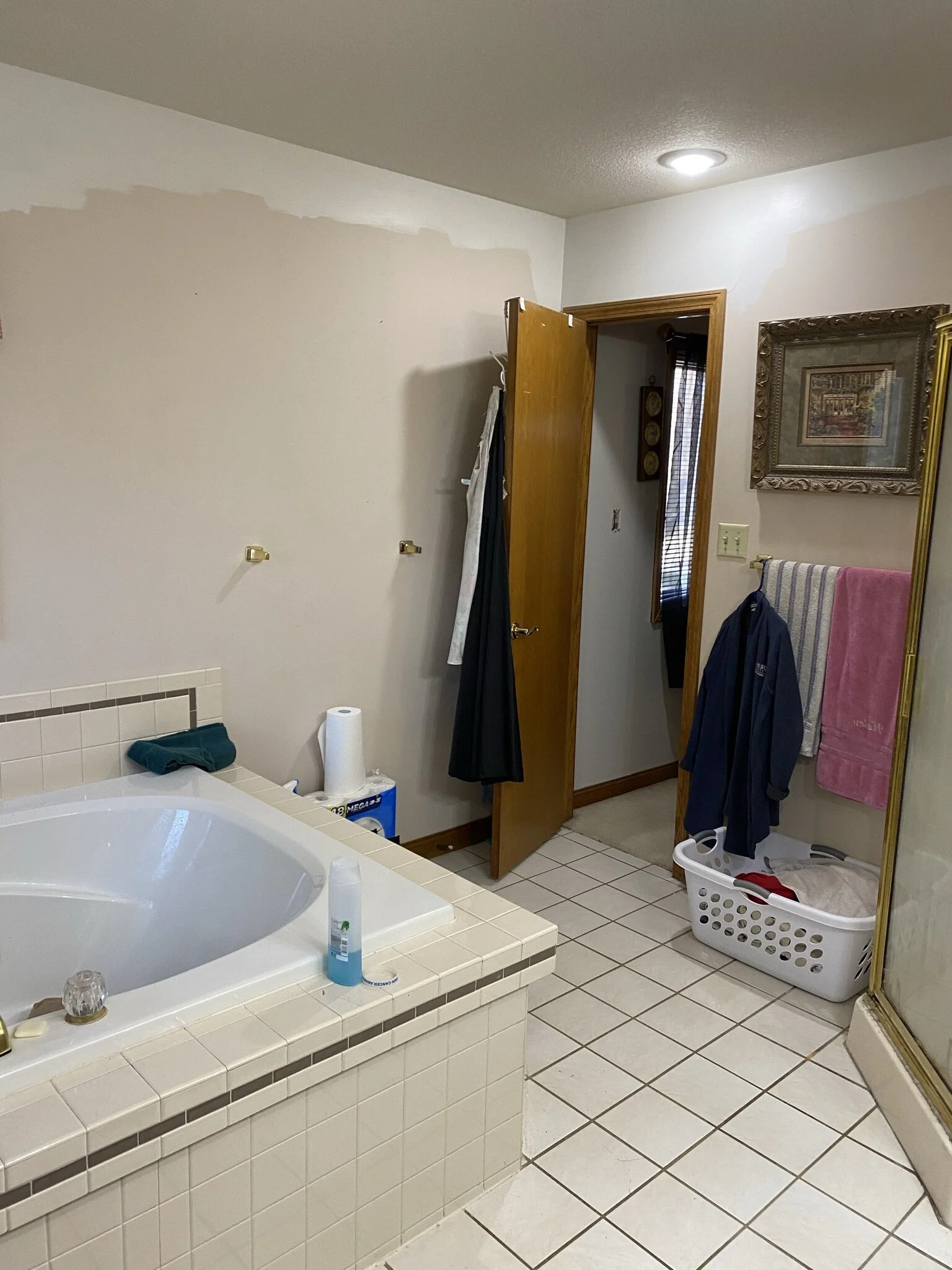
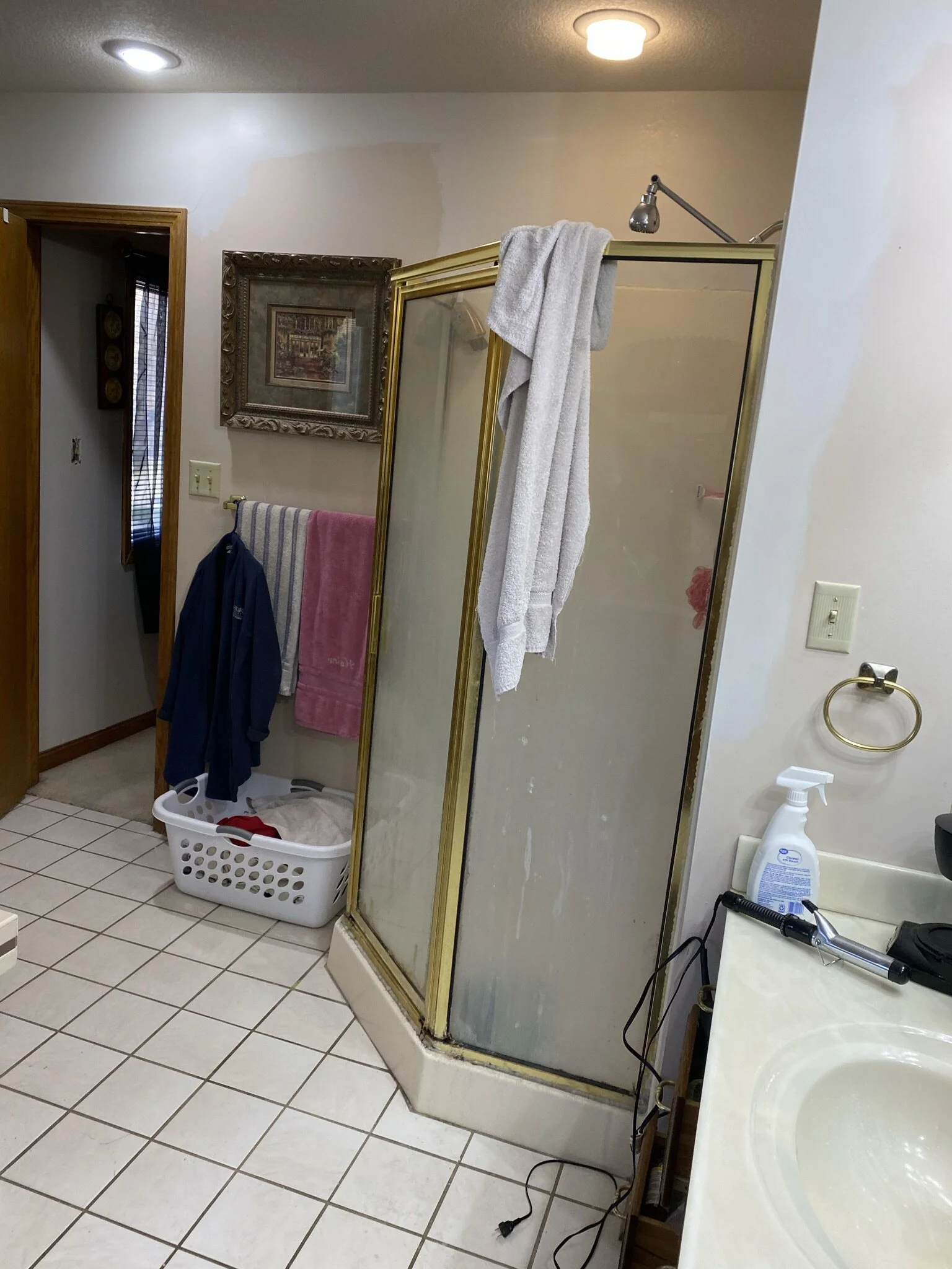
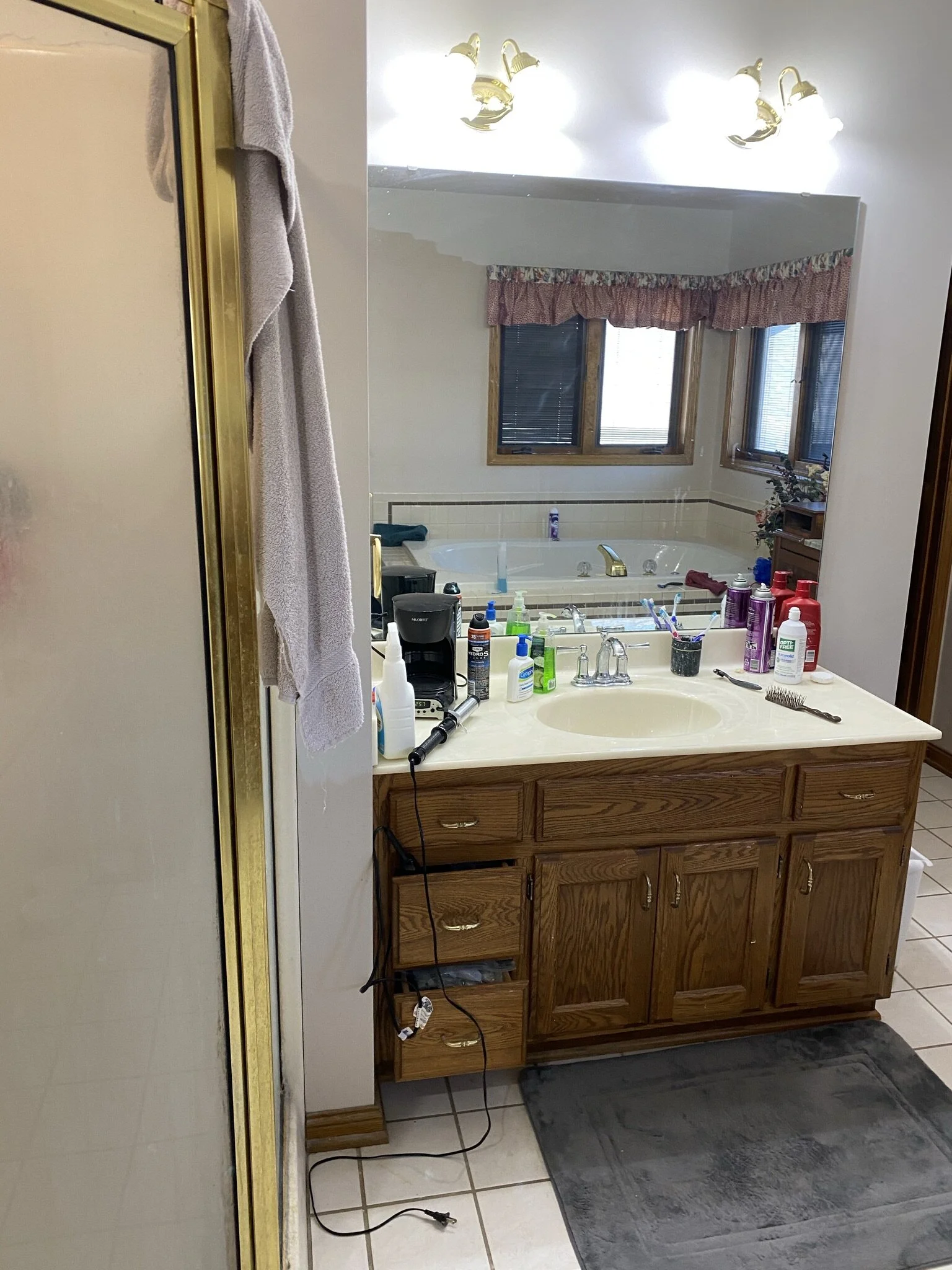
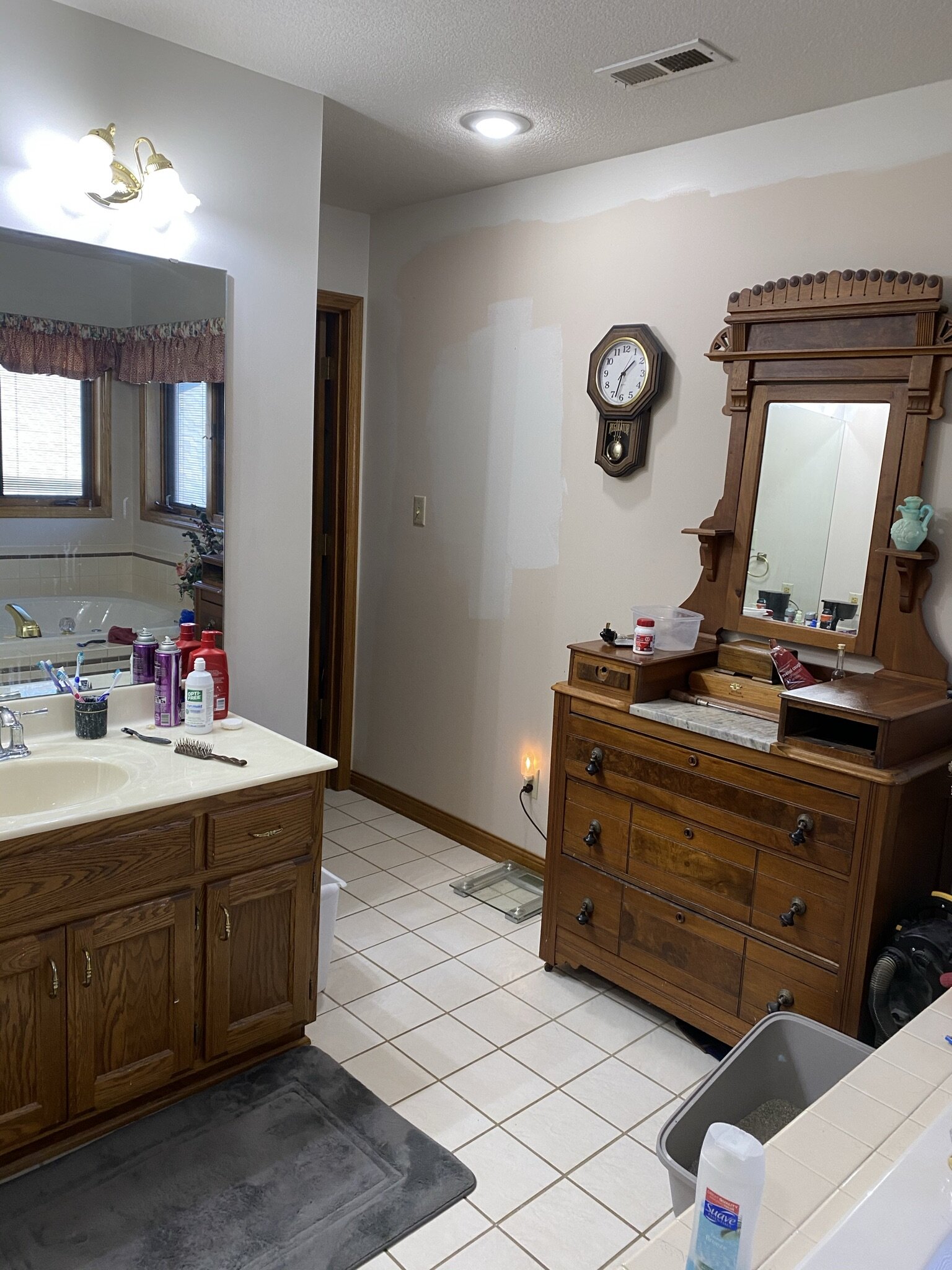
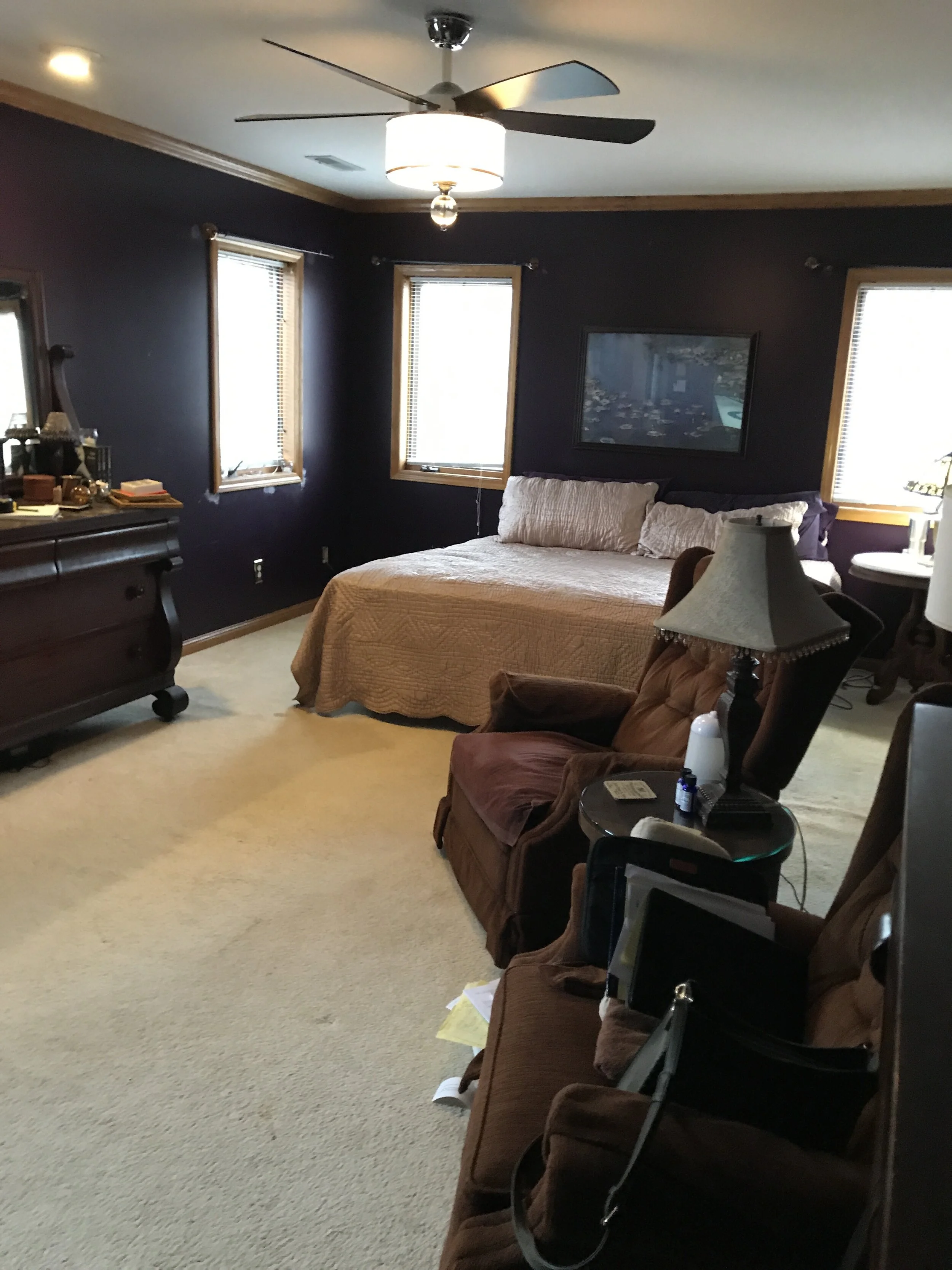
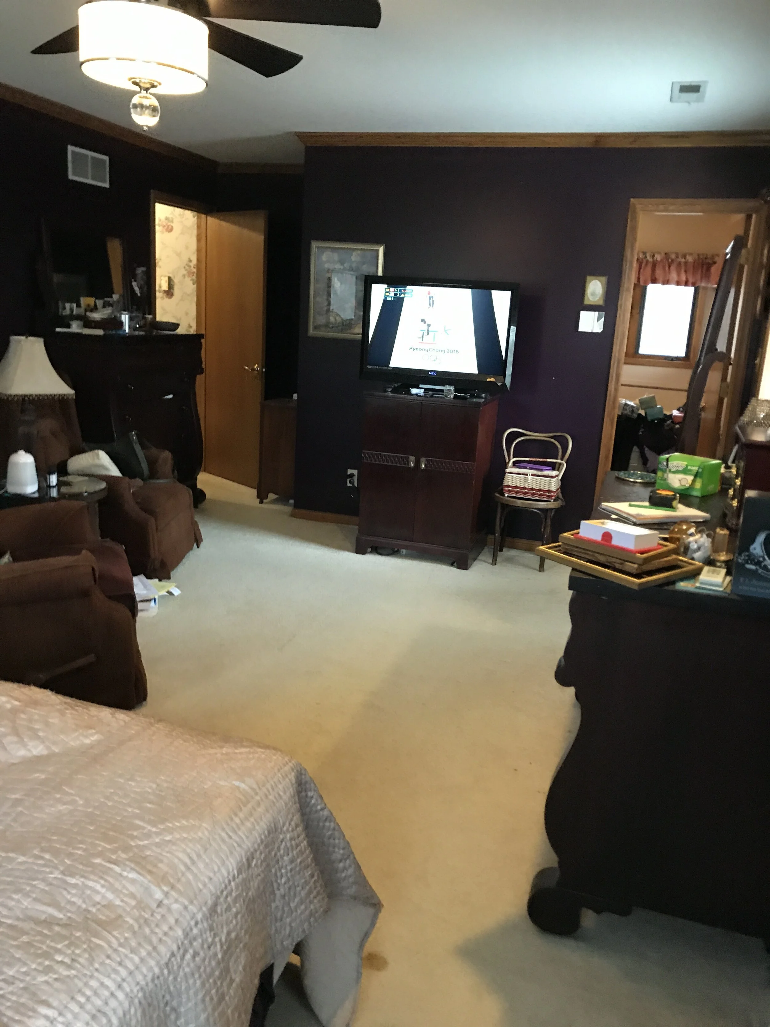
Week 1 | Week 2 | Week 3 | Week 5 | Week 6

How It Started

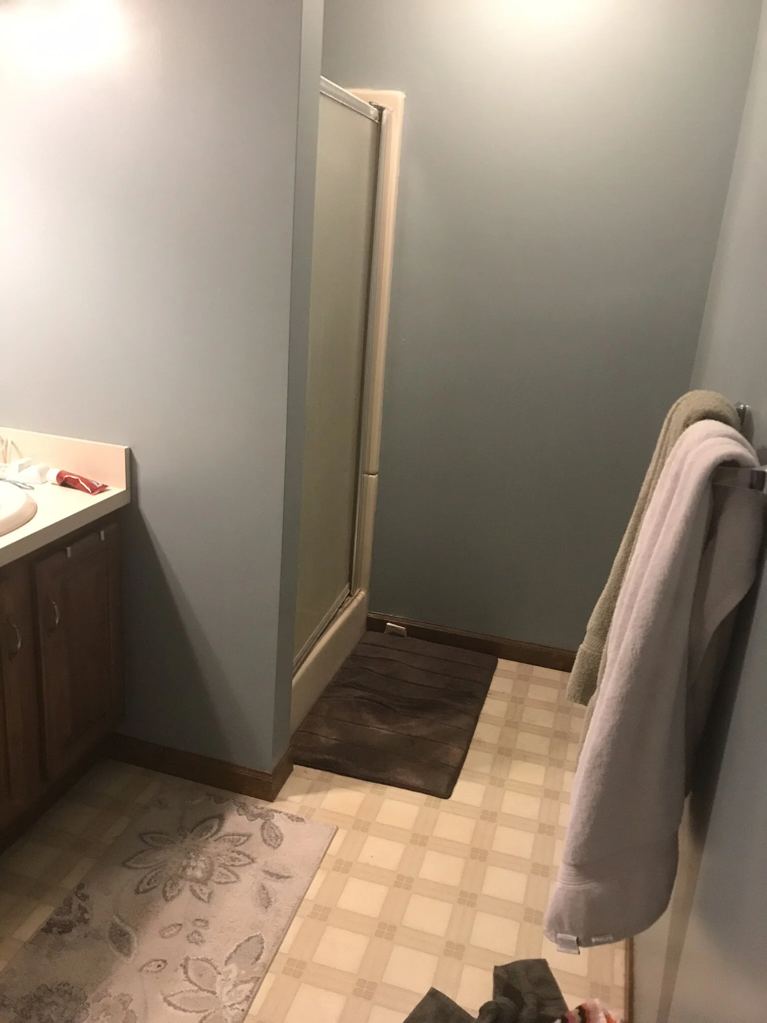
Just a reminder: here is a snapshot of what we were working with before the transformation began.
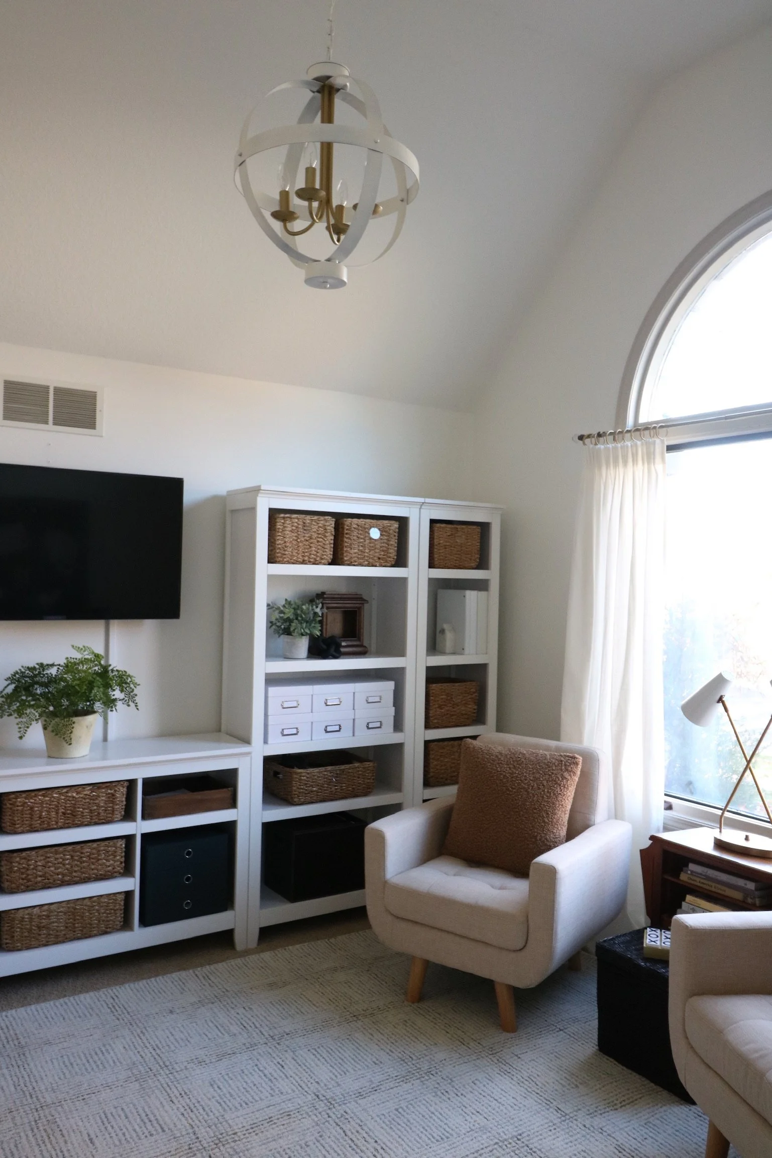
How It Ended

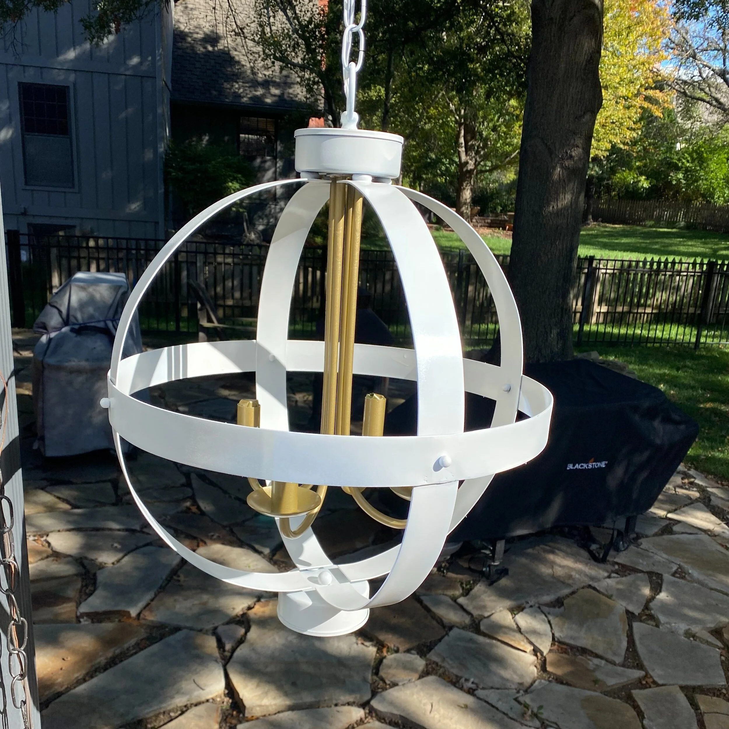
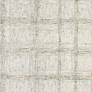
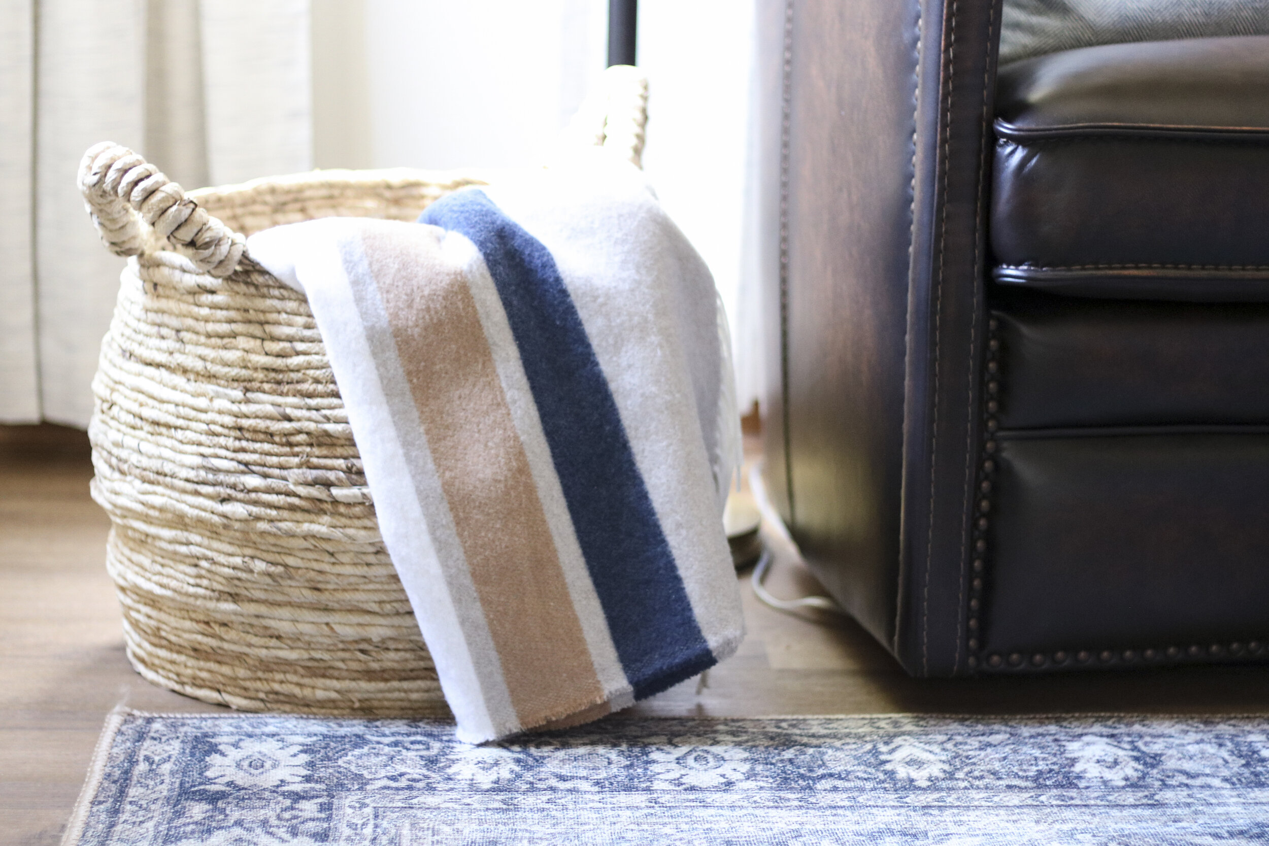
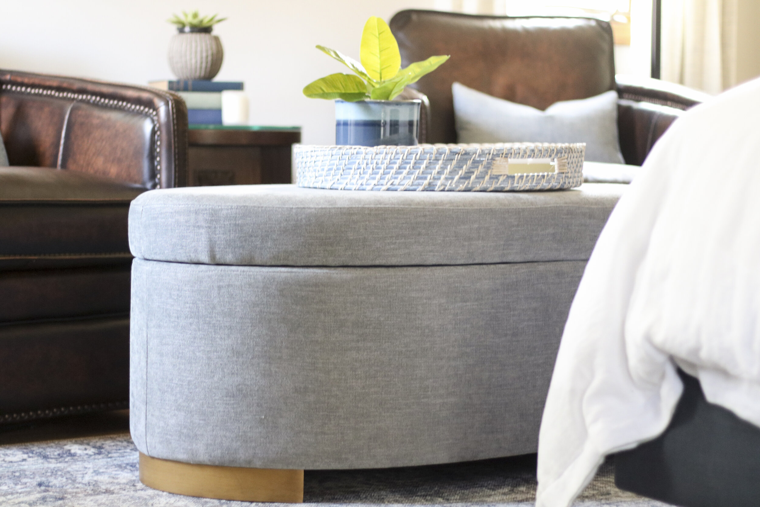
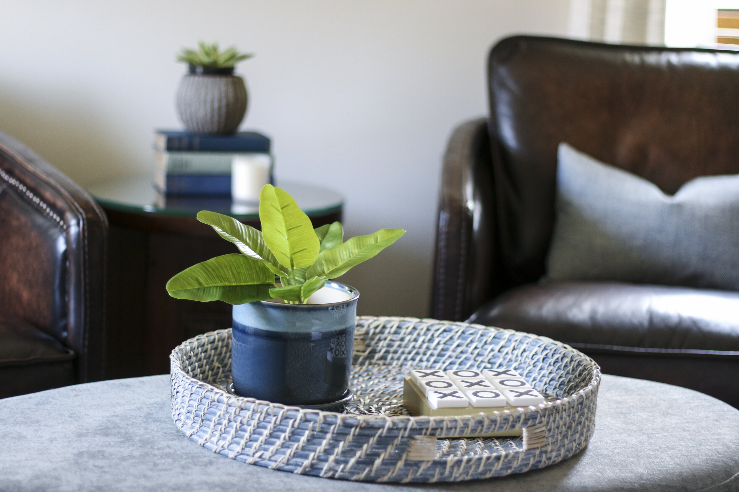
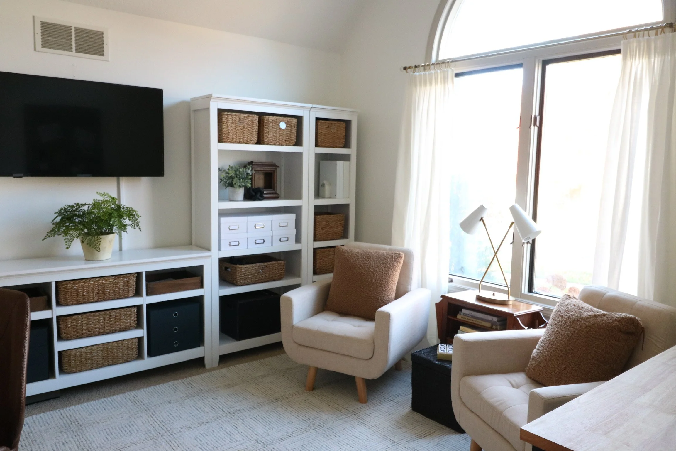
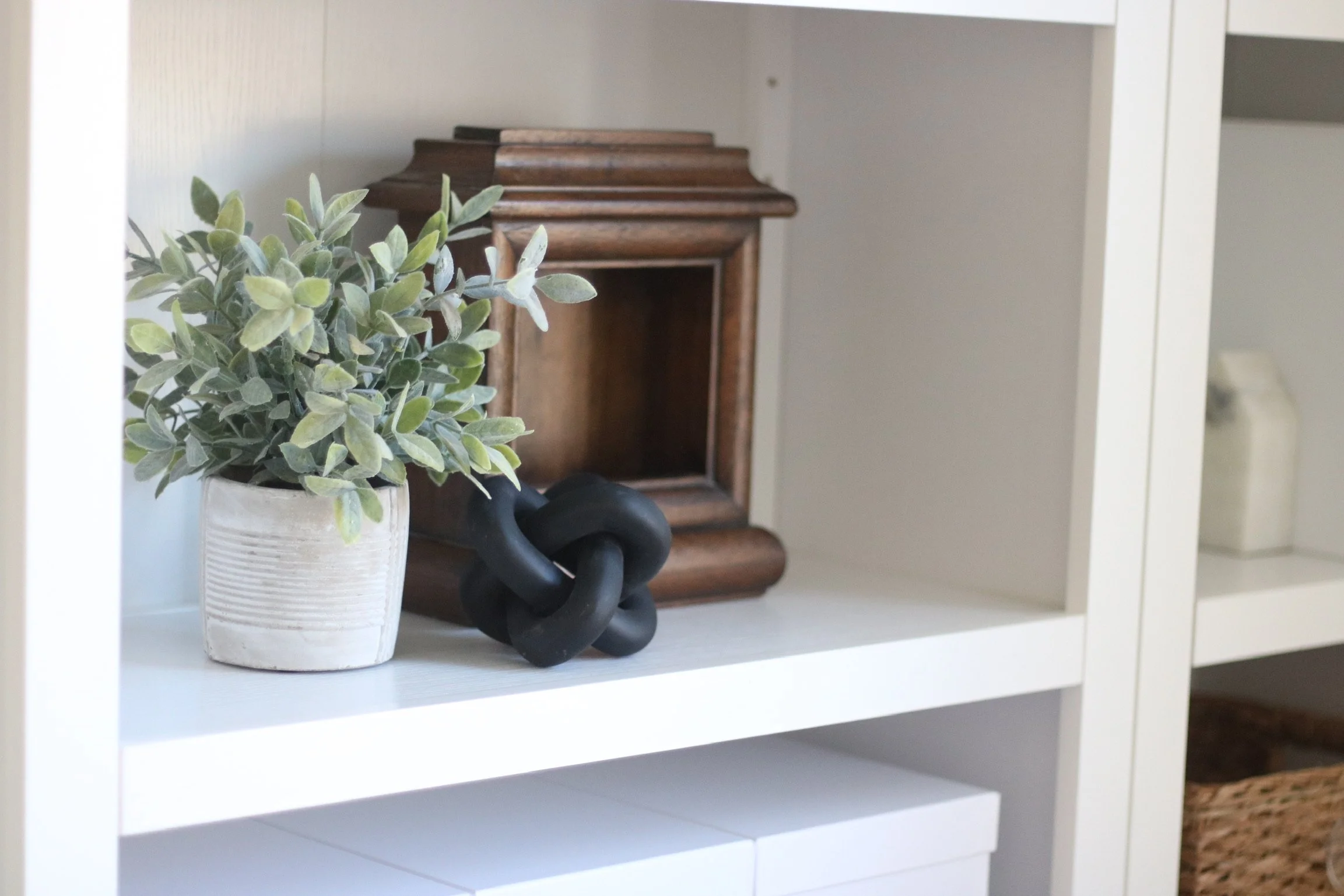
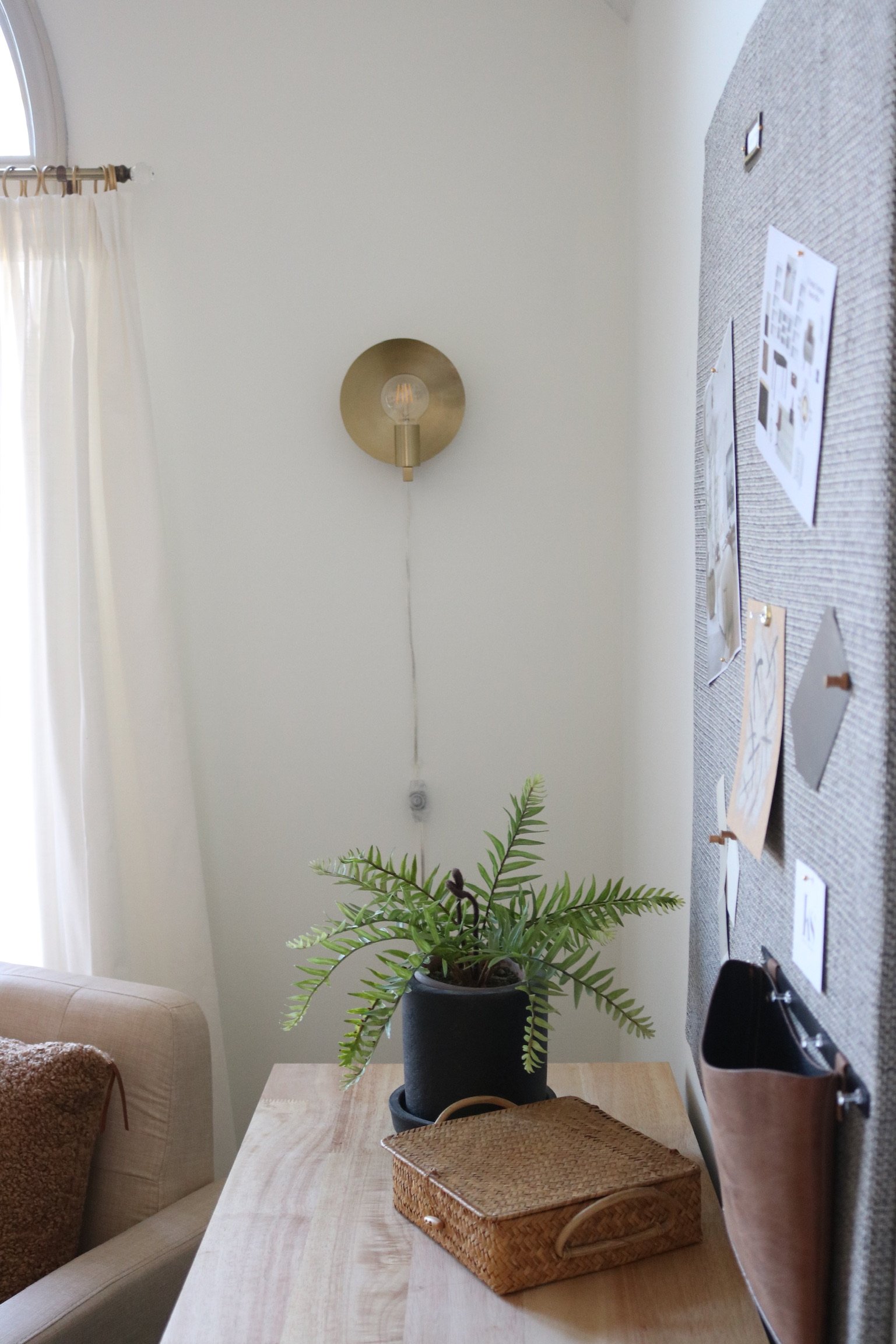
Here is the finished room! It ended up being this lovely mix of bright and cozy. Almost every item in the room is a neutral color, but there is plenty of texture—wicker, boucle, wood, leather, brass—keeping it from looking one-dimensional.

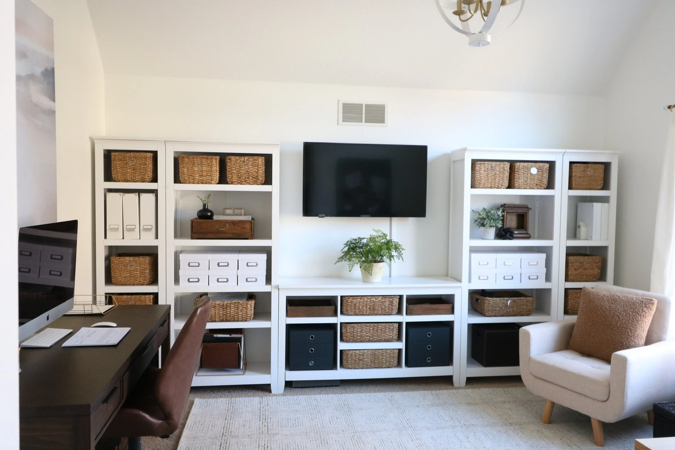
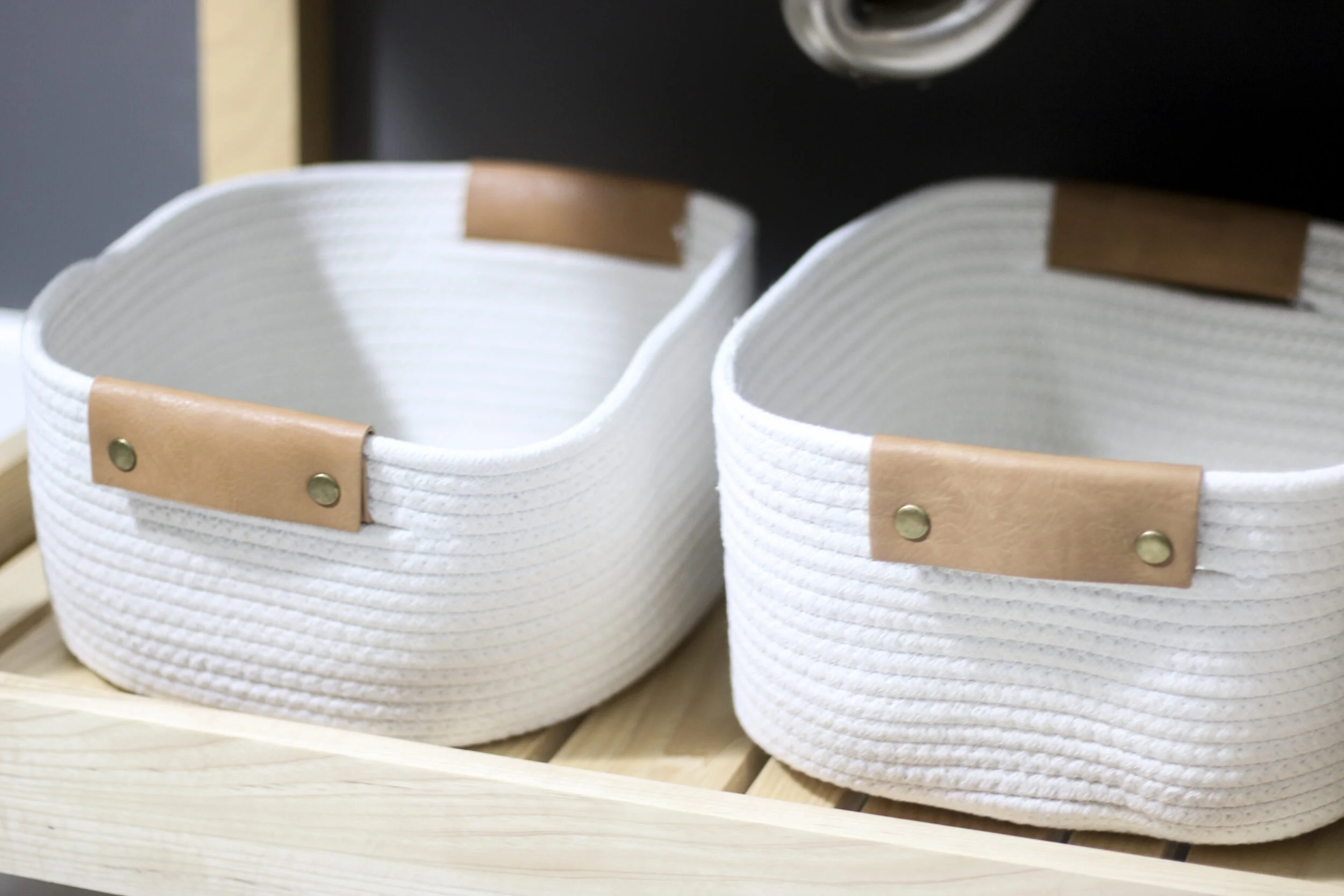
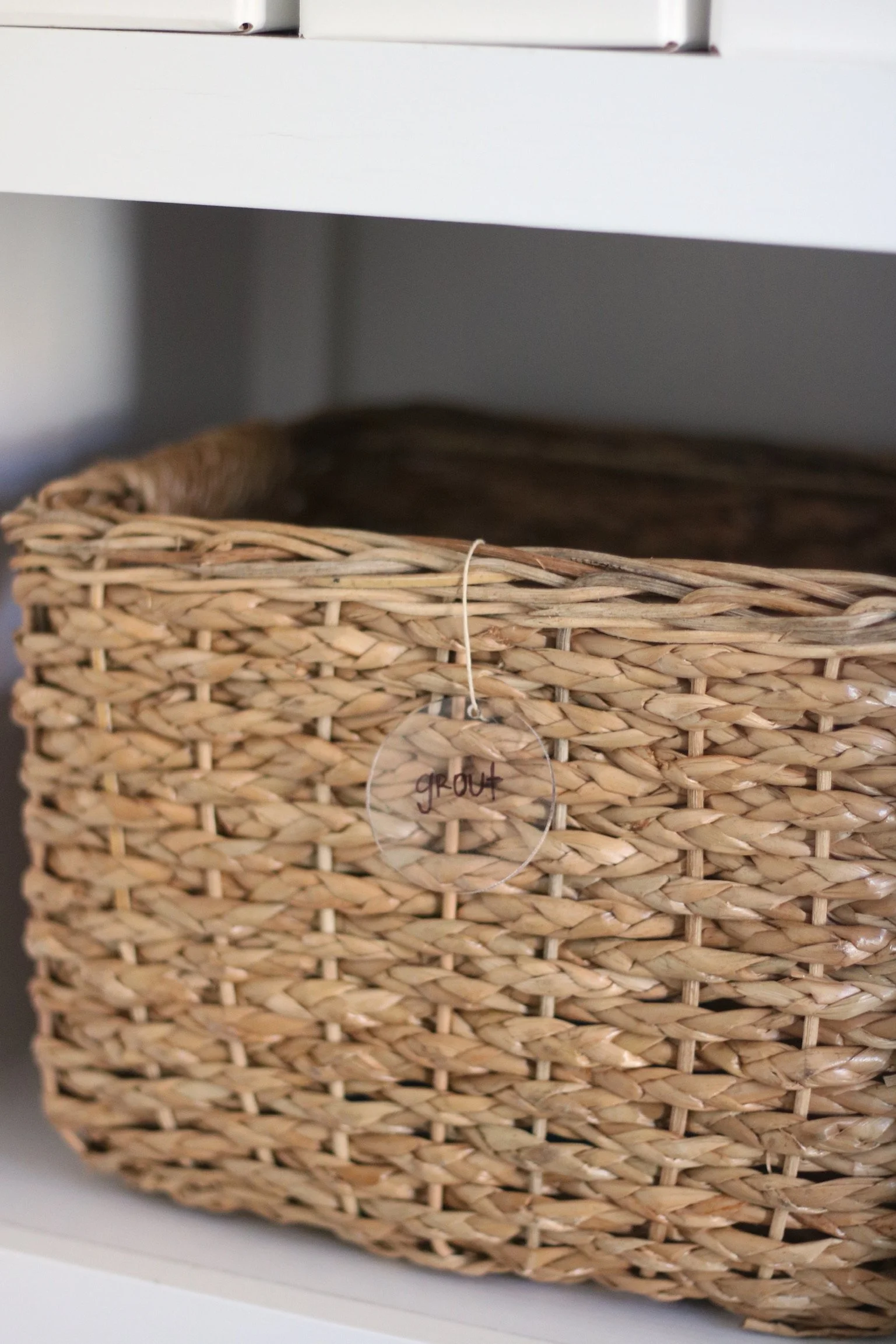
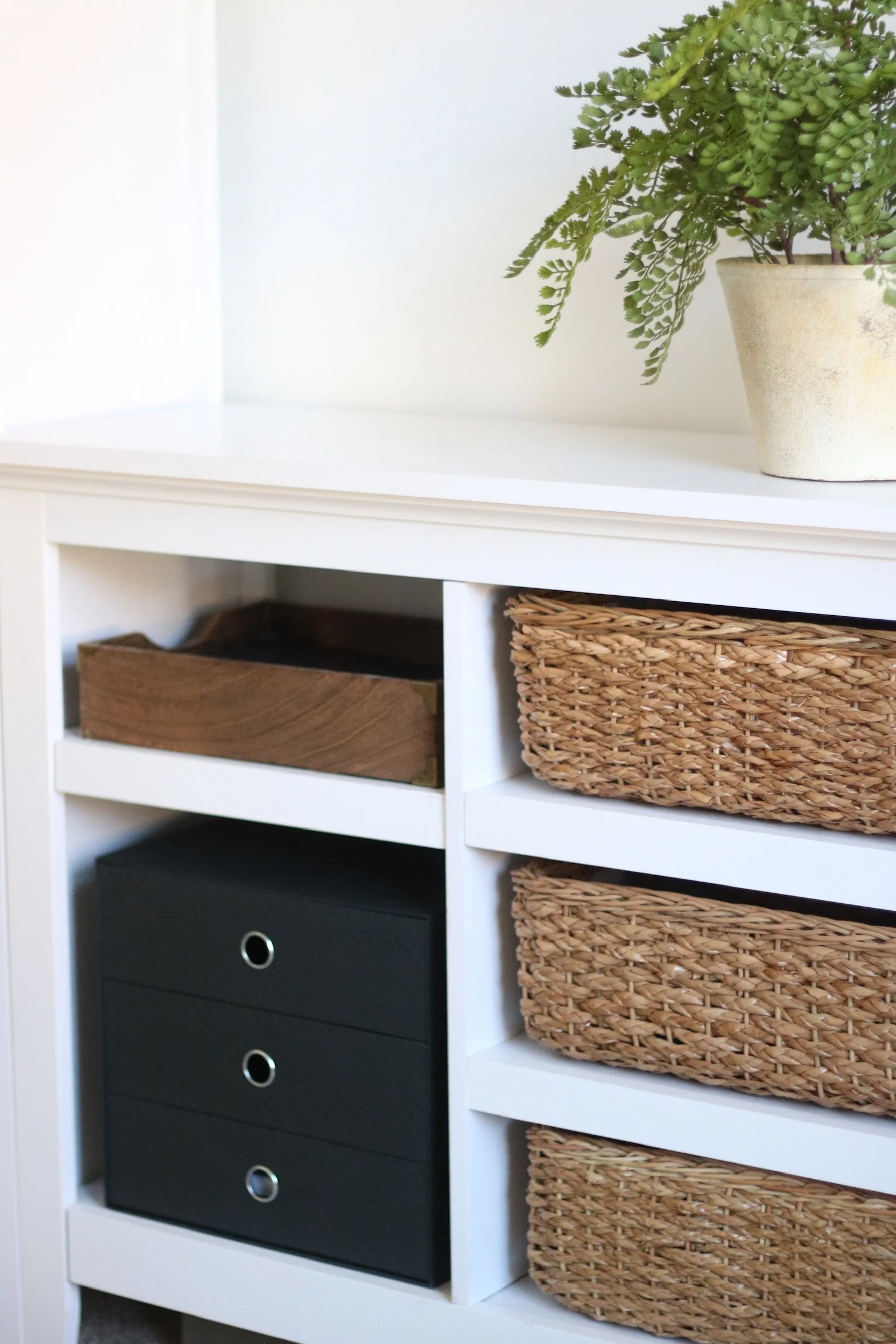
Check out all that functional storage! 👆Honestly, one of the biggest tasks was organizing everything. The home office had become a catch-all room for lots of random items, so everything had to be hauled out, sorted, and then placed in an appropriate home. Now, the home business office only has items pertaining to the business, and they are not only organized but labeled!! 🤓Wicker baskets and acrylic labels for the win.

And, we have to talk about the TV! The TV is for easily showing clients design proposals without everyone crowding around a computer screen. Plus, I am sure there will be some little ones occasionally watching it while we work. 🙈

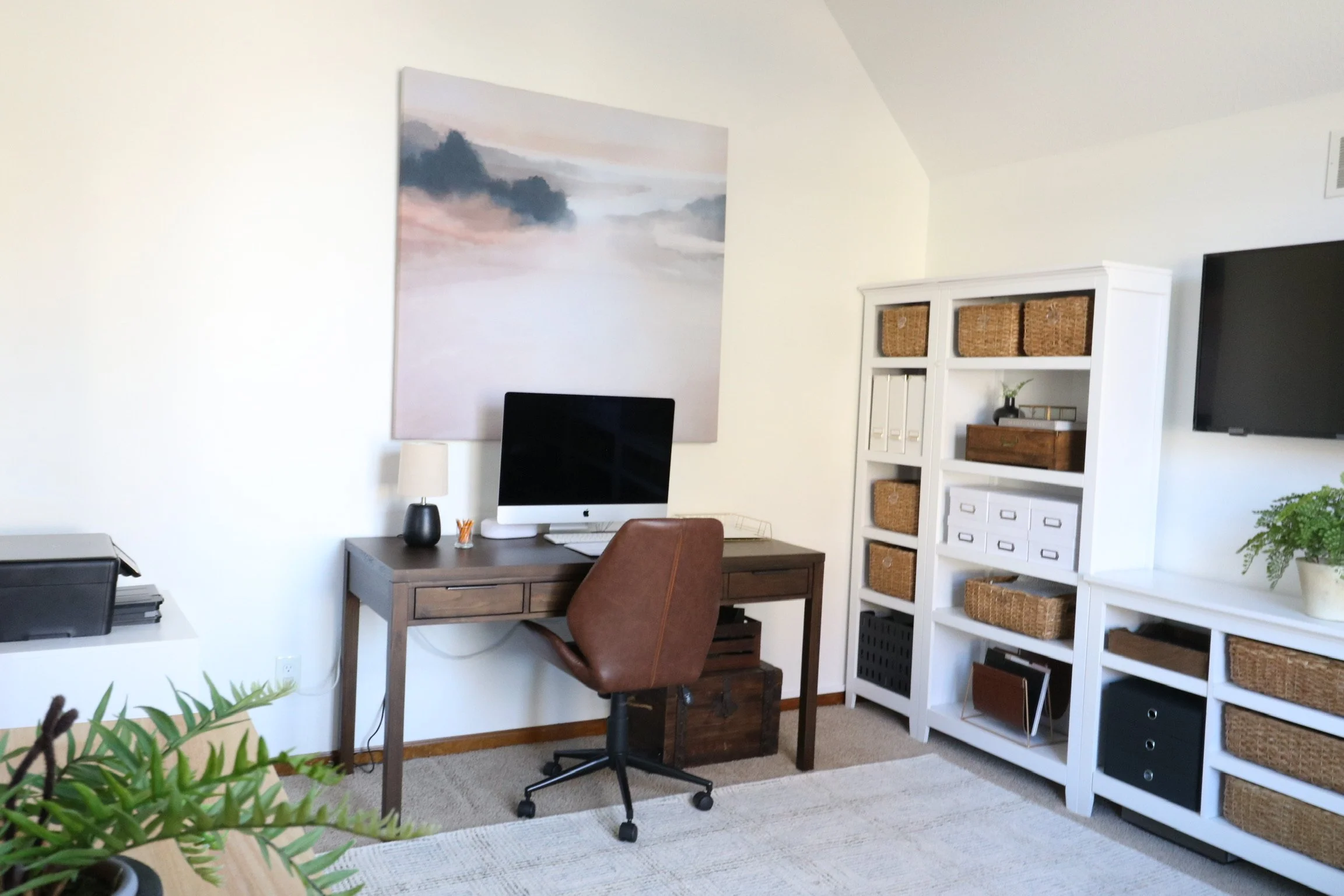
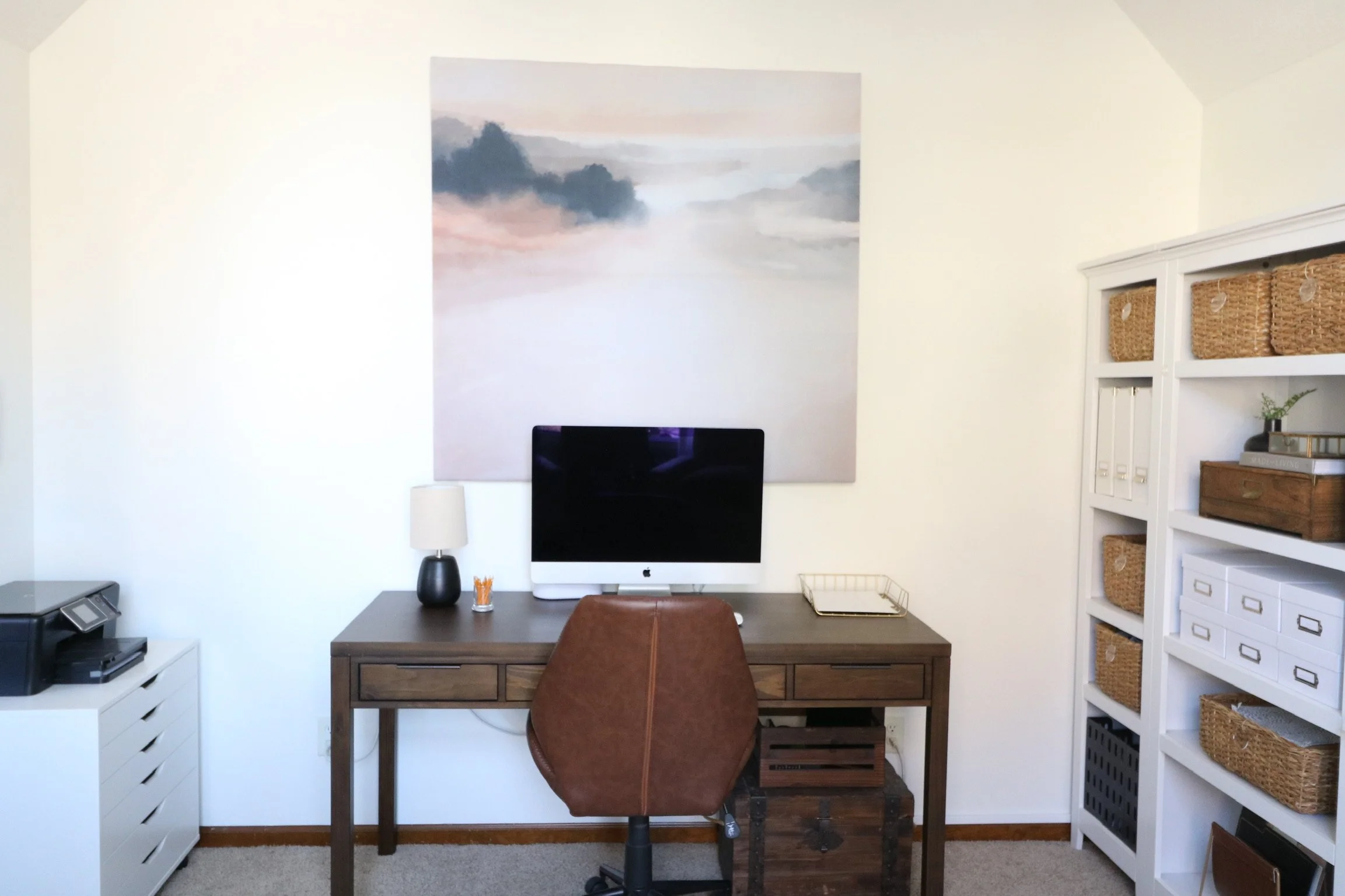
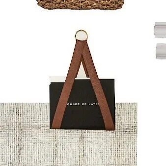
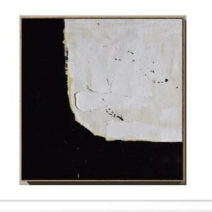
We knew that the wall behind the computer would need a LARGE art piece. We had seen several people use a shower curtain to create large art, so we gave it a try. After purchasing the shower curtain from Society 6, we built a wood frame in the dimensions that we wanted, then used a staple gun to adhere the shower curtain like a wrapped canvas. And it looks fantastic! Perfect way to have big art for way less than $100.

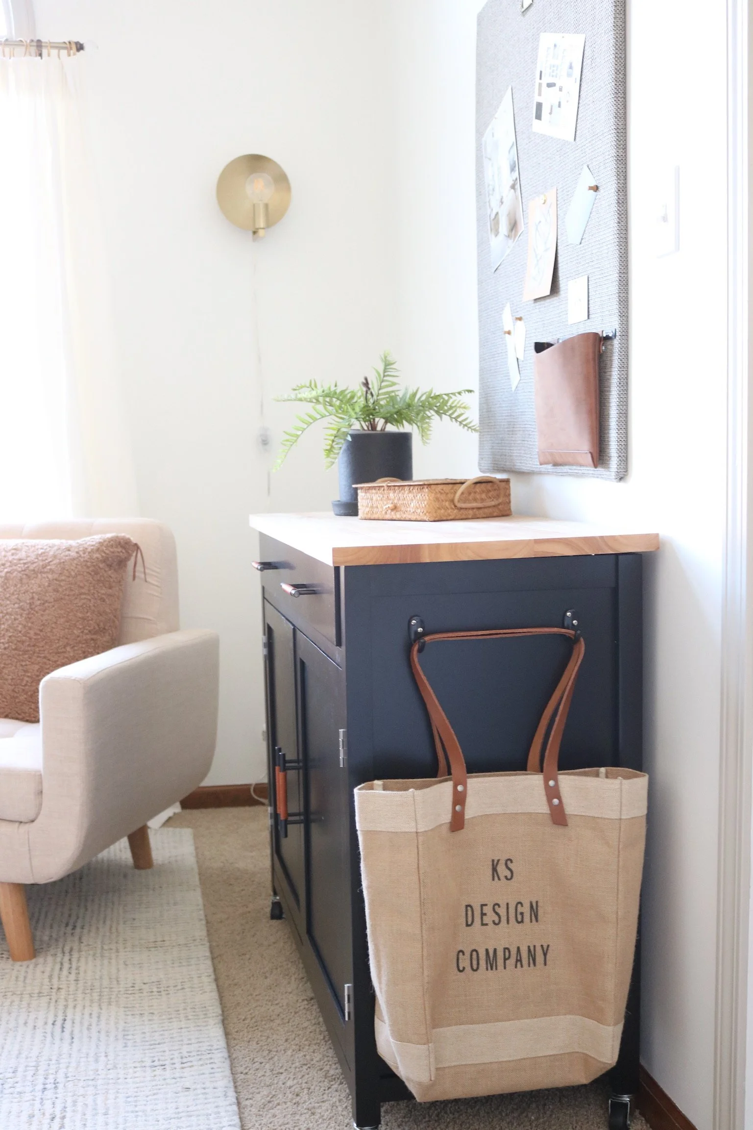
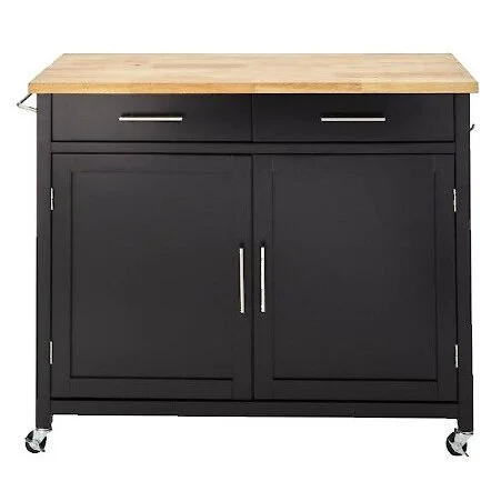
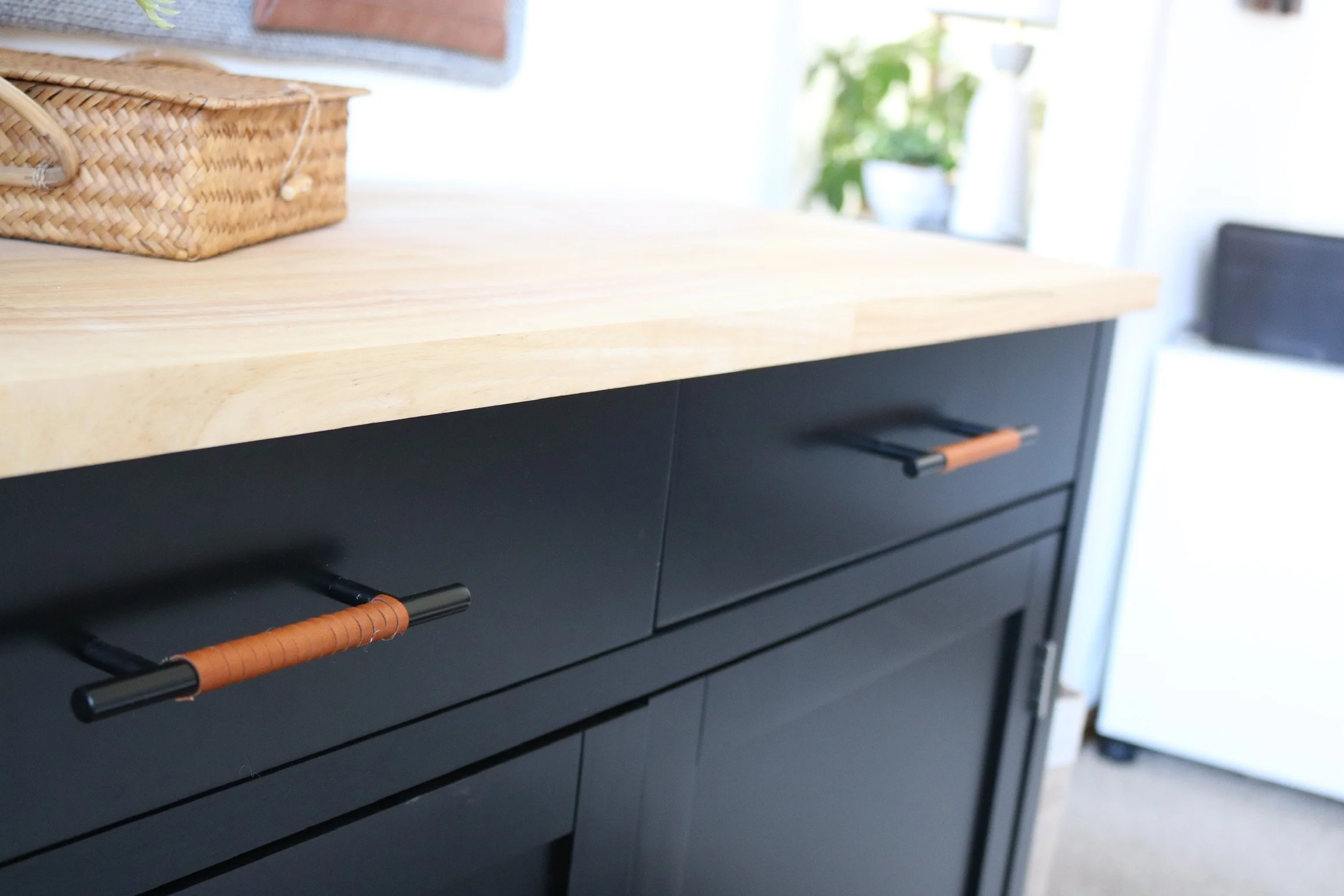
The black storage piece is a kitchen cart that we embellished to look less kitchen-y. It holds photography equipment. Above the kitchen cart, we made an inspiration board out of fabric and insulation board. It will be an easy place to tack up paint samples, fabric samples, and mood boards as we work on projects.

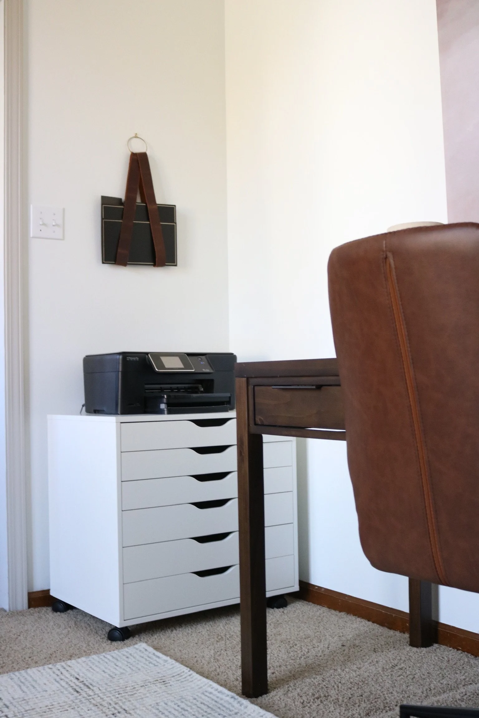
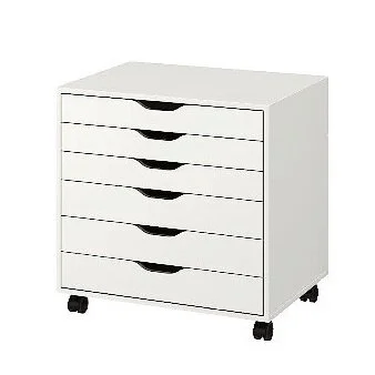
The last corner of the room houses the printer, a storage cabinet that holds large scale printouts of design boards, and our DIY file folder wall holder.

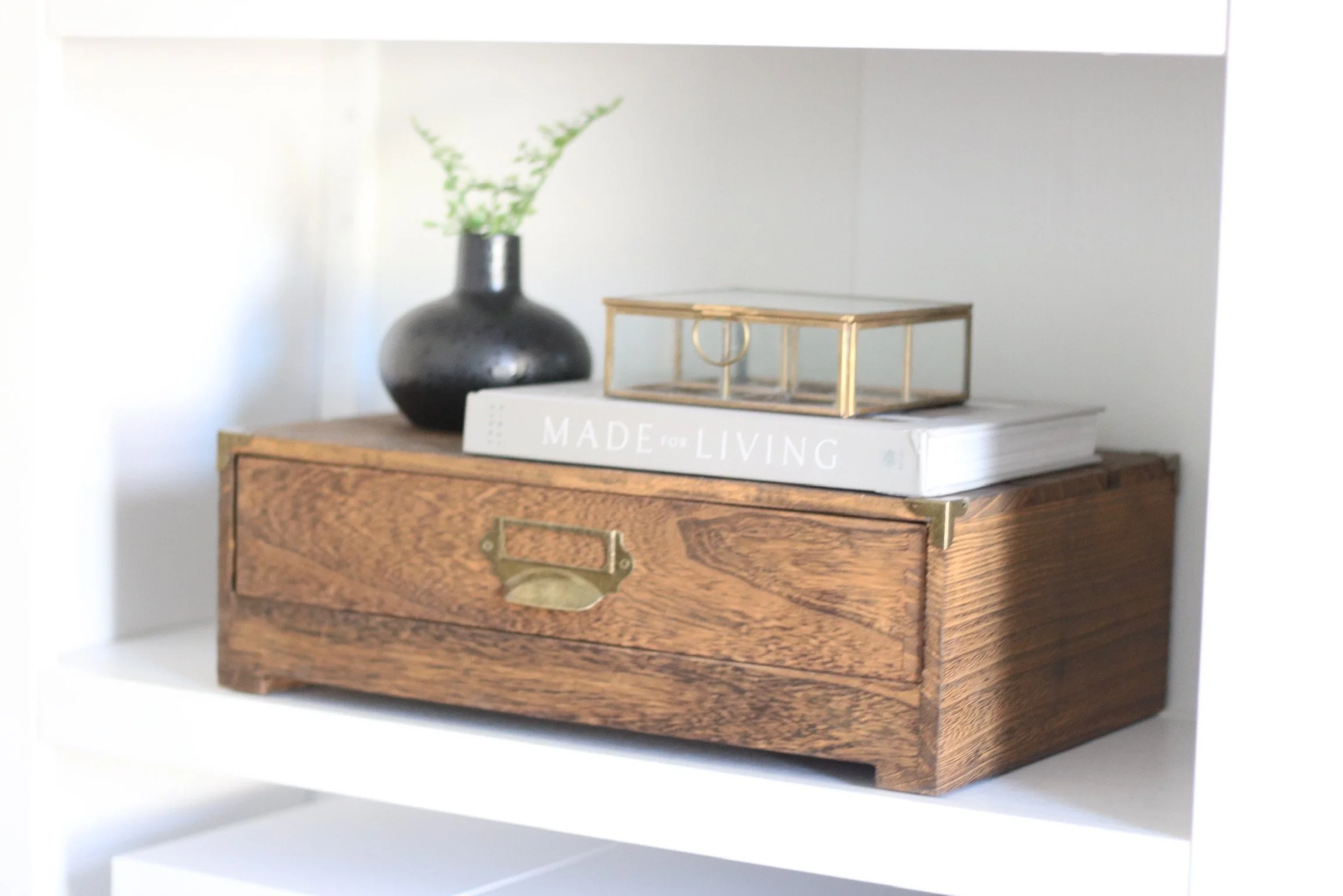
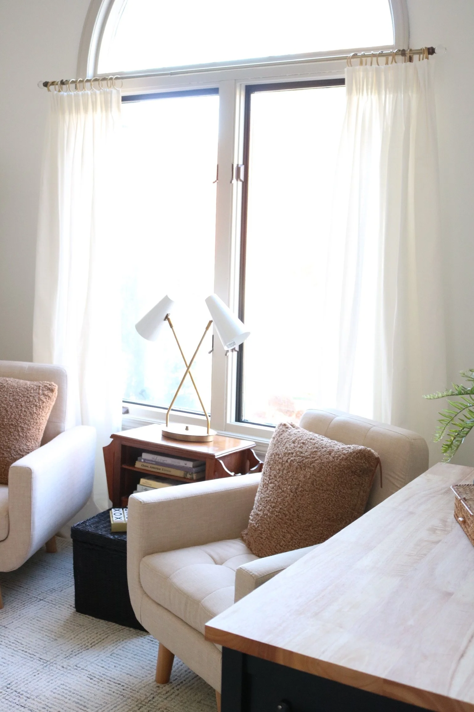
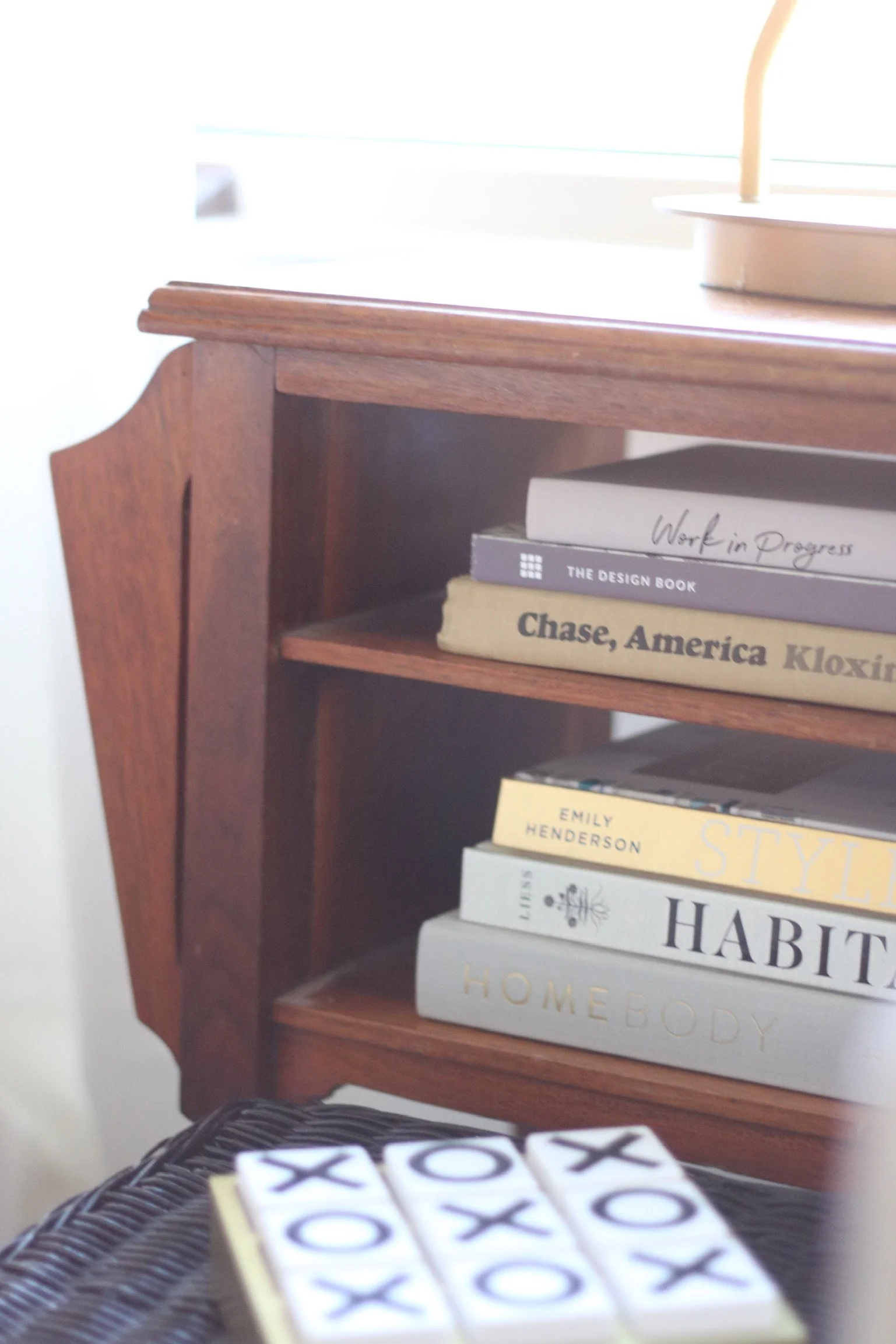
As always, the little details had a big impact. One of our favorite details is the side table between the two chairs (above right). The table was built by my grandfather during high school wood shop. That means it was built around 1940! 🤯Not only is the craftsmanship beautiful, but it feels right at home in this space.

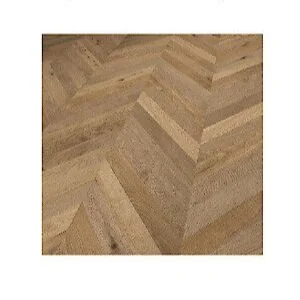
There is one major transformation left for this room: a wood floor! Right now, the old carpet is still hanging out underneath the rug, but the office will be getting hardwood flooring installed soon; the installation just didn’t work with the ORC timeline. Won’t the wood flooring will be the perfect finishing touch?

There was one last stamp of approval we had to get. Needless to say, they approved. 💛

This isn’t our first One Room Challenge rodeo. So if you enjoyed the home office transformation, check out our other ORC reveals. It truly is exciting every time.

Living Room Fall 2018 | Sun Room Spring 2019 | Basement Bathroom Fall 2019

The best part of the ORC is looking at everyone’s final reveals, which you can easily do from the ORC blog.

Thanks for stopping by!

Kylie and Staci

One Room Challenge | Week Six | The Good, The Okay, and The Disorganized

Things have been slowly coming together during Week 6 of the One Room Challenge. This week we worked on two quick DIYs and some organization.

The Good.

First up, we have an easy DIY win. We spotted these file folder hangers a while ago and loved them—they are basically functional art, perfect for the home office. Since we are trying to be budget-friendly wherever possible, we decided it was worth a shot to try and DIY them. The project required a gold metal ring (a silver ring from Hobby Lobby painted gold), a strap of leather (from Amazon), and some hot glue. We didn’t know how well the hot glue would hold, but it seems to be working great so far. 🤞Of course, this won’t be the only place we keep files, but it is a pretty storage option.

The Okay.

Next up, we worked on the kitchen cart turned home office storage unit. We originally wanted this kitchen cart because it was the size we needed, it had doors that swung open allowing us to easily store bulky photography equipment, and it was a good price. But, I mean, it looked like a kitchen cart. Great for the kitchen, not as ideal for the home office. So, we knew we had to snazz it up a bit. The first step was spray painting the chrome hardware matte black. This immediately elevated the look and meant we didn’t have to find new hardware that fit the predrilled holes. Then, we wrapped the middle portion of the handles with leather cord. The next small upgrade was adding S-hooks to the towel bar. This will allow us to hang objects, not just dish towels. Unfortunately, not all of our DIY plans were smooth sailing. We ordered some crocodile print removable wallpaper to adhere to the front of the cart doors. Unfortunately, although labeled black online, it definitely was dark green in person and didn’t blend into the cart like we were hoping. So that was a no go. Now, here’s the question: Should the kitchen cart be complete as is or should we try something else on the doors? Also, should we stain the butcher block top darker or keep it light?

The Disorganized. (turned organized)

One of the biggest tasks this week was trying wrangle all the stuff that will be stored in the home office into baskets on the shelves. So much stuff, so many baskets, so many labels. 😝We kept the wicker baskets consistent, so the shelves wouldn’t look too busy. For labels, we used acrylic discs that came with a predrilled hole at the top. We were able to write on them with Sharpie and tie them to the basket with twine. The best part of this labeling system is they look pretty up close, but then you don’t notice them from far away.

To keep on track, here is our to-do list. Italics indicate the item is in progress.

  • Choose a paint color for walls and trim

  • Decide on flooring (dependent on time frame)

  • Paint walls and trim

  • Source a desk or paint the one we have

  • Source or DIY art

  • Millwork

  • Source lighting

  • Source chairs

  • Decide if we want a window treatment

  • Source or DIY a rolling cart

  • Source organizing options: baskets, bins, boxes

  • Source labeling options for baskets

Although this to-do-list looks nearly complete, there is still so. much. to. do. Funny how that works. We are nearing the end though and are looking forward to the reveal photos. 🙌 Please check out all the amazing ORC rooms!

See you next week,

Kylie and Staci

One Room Challenge | Week Five | Paint...Finally!

Hello from Week 5 of the One Room Challenge! It is officially 🚨over the halfway point🚨 of the eight-week long ORC , so we decided it was time to get some paint on the walls. From the beginning of this home office makeover, we had a difficult time deciding if the wall color should be dark or if it should be a bright white. As much as we love moody walls in a home office, white walls won out for a very practical reason: white walls would make the white bookshelves have a more built-in look.

If you want to catch up on the home office progress, check out the past weeks.

Week 1 | Week 2 | Week 3


This is what the walls in the home office were when we started the project: a light taupe.

After some tired arm muscles and recruiting some help with that vaulted ceiling, here is the wall color now (this is the only corner of the room not a complete disaster 🙃). We chose the paint color White Gallery by Sherwin Williams for HGTV, and it is a very crisp white with practically no undertones. It definitely gives the room a blank slate feeling, so we are ready to start adding all the new furniture into the space.

Although you can’t see it in the pictures, the baseboards are still wood, and they will stay as they are. The flooring will be changed to hardwood in the near(ish) future, so it didn’t make sense to spend a lot of time painting baseboards that will be replaced anyway—even though white baseboards would look nice. The trim around the window and the door frame did get a little extra love though. That trim was painted Revere Pewter by Benjamin Moore at 50% darker, which is a light greige color. Let’s face it, a white room can read a little boring, so the contrasting trim adds some dimension. Then, we painted the very inside piece of the trim (the actual trim of the window) black to go one step further with adding dimension.


Beyond painting, we have been unboxing and putting together furniture. (The best furniture assembly helper featured above ⬆️). All the major furniture pieces have arrived. 🎉

This week will be all about working on some of the DIYs. Upgrading a kitchen cart, creating file folder hangers, and trying our hand at some art are on the agenda. Thanks for checking in!

See you next week,

Kylie and Staci

One Room Challenge | Week Three | Overhead Lighting

Hi, there! It’s Week 3 of the One Room Challenge, and we have made our first physical change to the home office. If you missed the past two weeks, make sure you check out where the room started and where it is headed.

Current Reality

Here is what our week has really looked like.

We have been busy hitting the buy button, tracking those deliveries, and temporarily setting those boxes in the middle of the office. So many things have been delivered in the past week: a cart, a storage cabinet, two chairs, a wall sconce, and trim paint. 😅And a desk and rug are on their way! All of these things will be fun to show off in the future; they just aren’t quite ready yet. But! We did squeeze in a small DIY this week and the office got updated overhead lighting.

Overhead Lighting

Just as a reminder: here is what we were starting with as far as overhead lighting goes (aka there was none, just a ceiling fan that was original to the house).

When planning for the office, we came across this light fixture and were intrigued. We had an old light fixture from when we redesigned the sunroom that had a similar shape. Could we repurpose a light fixture that we had previously discarded with a little paint?

First up, the middle portion of the chandelier got two coats of gold spray paint. Then, that portion got covered, and the outer portion was sprayed with white.

Here is the finished product! Not an earth-shattering DIY, but it checks all the boxes: Will it look good in the finished space? ☑️ Is it cost effective? ☑️Does it feel good to repurpose something you already own? ☑️☑️

What do you think? Worth the DIY to save over $600?

To keep on track, here is our to-do list. Italics indicate the item is in progress.

  • Choose a paint color for walls and trim

  • Decide on flooring (dependent on time frame)

  • Paint walls and trim

  • Source a desk or paint the one we have

  • Source or DIY art

  • Millwork

  • Source lighting

  • Source chairs

  • Decide if we want a window treatment

  • Source or DIY a rolling cart

  • Source organizing options: baskets, bins, boxes

  • Source labeling options for baskets

See you next week,

Staci and Kylie

ORC-Guest-400x218.png

One Room Challenge | Week Two | The Home Office Plan

After a last minute decision to participate in the One Room Challenge, last week we left off wondering if we should go light and bright in the home office or if we should go dark and moody? Well, we talked it through and are going for all things ✨light and bright✨.

The decision really came down to wanting to reuse some white bookshelves but not wanting to paint them (for fear of them not handling paint that well). We didn’t want the bright white bookshelves to look too stark against dark walls, so light walls made the most sense.

With that decision made, the design could really take off. So…🥁🥁🥁…here is the office design!

Home Office Design Board.jpeg

It’s neutral. It’s full of texture. It’s functional with LOTS of storage. I mean, all work done in this office should be calm and refreshing because of the all the tranquil vibes this design is giving. 😉

Design Breakdown

Home Office Design Board.jpeg

Storage Needs

Besides the massive bookshelves that will provide storage, we plan on making some upgrades to a kitchen cart (we’re excited for the challenge of this one and hoping it turns out well 🤞). We will also add an Ikea storage unit, and then hang some beautiful/functional wall storage, like these file folder holders.

Home Office Design Board.jpeg

Flooring

The flooring will be a bit of a toss up! The end goal is a wood flooring laid in a chevron pattern (left image). And that will happen—just potentially not on the ORC timeline. If the flooring cannot go in before the final reveal, then we plan to get a rug (like the right image) to place over the carpet that is already in the room.

Home Office Design Board.jpeg

Other Touches

We are going to try our hands at a few fun projects: revamping an old light fixture so it looks similar to the inspiration on the left, adding some millwork to the wall (perhaps highlighting some wall sconces), and DIYing some large art.

Floor Plan

The floor plan of the room will stay similar to the current one, but since every aspect of the room is getting an upgrade, we don’t mind. We actually played around with a few other floor plan options, but this one made the most sense. Here are some aerial and side views, so it is easier to conceptualize the space.

Home Office Aerial Floor Plan.png
Home Office Aerial Illustrated Floor Plan.png
Home Office Illustrated Side Floor Plan.png

To keep on track, here is our to-do list. Italics indicate the item is in progress.

  • Choose a paint color for walls and trim

  • Decide on flooring (dependent on time frame)

  • Paint walls and trim

  • Source a desk or paint the one we have

  • Source or DIY art

  • Millwork

  • Source lighting

  • Source chairs

  • Decide if we want a window treatment

  • Source or DIY a rolling cart

  • Source organizing options: baskets, bins, boxes

  • Source labeling options for baskets

That’s it for this week of the One Room Challenge. Check back next week for progress updates!

See you next week,

Kylie and Staci

ORC-Guest-400x218.png

One Room Challenge | Week One | The Home Office Before

It’s time for the One Room Challenge! We decided at the very last minute to jump in and join the many guest participants in designing one room in eight weeks. Between a baby being born, a wedding, and the pandemic, we have taken a break from the ORC, but are looking forward to the challenge once again.

If you are new to KS Design Company, welcome! We are a mother-daughter design team working in the Topeka and Kansas City metro. We started KS Design Company a few years ago and love working together! In past rounds of ORC we have designed a living room, a sunroom, and a basement bathroom.

ORC-Guest-400x218.png
IMG_3063.jpg

This go around we will be working on our KS Design Company home office. When I said we decided to join the ORC at the last minute, I wasn’t kidding. So, this week you will only see before shots of the office. 😉We are frantically working on a design so check back next week for design plans! Since we have been in business for a couple of years now, we have collected a lot of samples: tiles, fabrics, flooring, a little of everything. Our first goal is to get the office organized. When the office was originally designed years ago, it wasn’t functioning as a home business office. As it has evolved into one, the storage has become rather hodgepodge. In the redesign, we are going to try to repurpose several pieces we already have and add some storage solutions.

IMG_3072.jpg

The second goal is to make the office beautiful. The office is right off of the entry of the home, making it one of the first things people see when they visit. Plus, it will be where we are meeting with clients. Needless to say, we would like the space to be functional and beautiful!

IMG_3061.jpg

Some items we are addressing in the room are lighting, flooring (not sure we can get that accomplished in 8 weeks!), seating, a good spot to lay out client presentations, and storage, storage, storage!

The office is 12x13. That’s not huge, but workable. It does have a vaulted ceiling, so that is a plus. It also has a big window that helps with lighting. The big design question we are trying to answer: should we go dark and moody or light and bright??

To keep on track, here is our to-do list.

  • Choose a paint color for walls and trim

  • Decide on flooring (dependent on time frame)

  • Paint walls and trim

  • Source a desk or paint the one we have

  • Source or DIY art

  • Millwork

  • Source lighting

  • Source chairs

  • Decide if we want a window treatment

  • Source or DIY a rolling cart

  • Source organizing options: baskets, bins, boxes

  • Source labeling options for baskets

Make sure you check out all the other amazing participants in the One Room Challenge!

See you next week!

Staci and Kylie

A Main Bathroom Transforms Into A Timeless Oasis

Right off the main bedroom, the main bathroom has that wow factor and continues those modern traditional vibes. Get ready for a fun before and after!

Carpenter Bathroom 02.jpg

The Before

The main bathroom hadn’t been truly updated since the homeowners built the house in 1990. The homeowners’ priority was to make the space more functional. The shower felt cramped, they didn’t love having the toilet in a water closet, and the location of the vanity didn’t allow for a double sink. The solution? A new footprint for the bathroom!

Carpenter Bathroom 18.jpg

The After

Quite the change, right? Reworking the layout made all the difference. First up, the water closet was removed. Taking down those two walls that separated the toilet from the rest of the room instantly opened up the space and made it feel brighter. The vanity, which had previously been on a wall housing the water closet, was moved across the room. Instead of having a single sink, the homeowners could now fit a double sink. The bathtub and shower stayed in the same locations, but the shower was expanded.

Carpenter Bathroom 17.jpg

Vanity Area

Mixing metals can feel risky, but it almost always pays off, and the vanity area is a prime example of how gorgeous chrome and gold can look together. The sconce between the vanity mirrors is not only a knockout piece, but the mix of the two metals pulls it all together.

Side Note: Another aspect to consider is shape. With rectangular mirrors, this area would read a lot more boxy. The subtle curve of the arched mirrors brings something extra, and it matches the curve of the facets.

Carpenter Bathroom 03.jpg

Bathtub Corner

Who doesn’t love a good soaking tub? This one is that nice mix of modern and traditional. But the most delightful aspect of this corner is all that natural sunlight from the windows. Taking out the blinds within the windows and painting the trim were easy fixes to keep that corner extra airy and bright. That corner of the house doesn’t face any neighbors, so window treatments weren’t even necessary. Let in all the sunshine, please. ☀️

Carpenter Bathroom 14.jpg

Flooring and Rug

The floor tile is an 18-inch hexagon. The cement gray color acts a neutral backdrop for all the other bathroom elements. And the best part that you can’t see? The floor is heated. So heavenly.

The runner in front of the vanity is actually a Ruggable, a rug where the top layer can be removed and washed. This concept works well in any bathroom but especially works well in a bathroom that the homeowners’ cat likes to hang out in. Plus, that blue color really pops.

Carpenter Bathroom 21.jpg

Lighting

The overhead lighting definitely adds a bit of sparkle to the space. ✨ That natural light from the windows shines through the pendant light and projects a glistening pattern onto the ceiling. It’s probably the closest you can get to having a disco ball in your bathroom.

Side Note: Going fun with lighting can add just the right amount of whimsy to a space.

Carpenter Bathroom 16.jpg
Carpenter Bathroom 09.jpg
Carpenter Bathroom 13.jpg

Little Touches

We kept the accents minimal and continued the colors from the main bedroom: blue, black, and gold. The goal was simple and pretty accents.

Side Note: It’s inevitable that you will be putting some things on bathroom surfaces (soap, makeup, etc.), so keeping bathroom accents minimal and functional, mainly plants and candles, helps the surfaces from feeling crowded.

Carpenter Bathroom 04.jpg
Carpenter Bathroom 23.jpg

Wall Art

The art for the room came together organically, and we didn’t end up sourcing a single piece! For behind the fiddle leaf fig and next to the ladder holding towels, the homeowners’ daughter-in-law painted three beautiful pieces: two mixed media canvases and one landscape of Branson, a favorite vacation destination for the family. On the bathtub wall, we used two pieces that the homeowners already owned, and they worked really well stacked vertically, bringing some blue to that side of the room.

Carpenter Bathroom 15.jpg

Shower Area

We wanted the tile choices to feel timeless without veering into boring. A subway tile laid in a running brick pattern definitely falls in the timeless category, but picking a subway tile that came in variegated shades of white/gray/taupe adds that visual interest. The small hex tile works so well in the shower pan because it mimics the shape of the bathroom floor tile, mimics the colors of the shower wall tile, and the small shape keeps the shower floor from becoming too slippery.

Side Note: Bathrooms can easily become too sterile, so little touches of organic materials go a long way. The teak shower bench and the wooden towel ladder break up the whites and grays.

Carpenter Bathroom 19.jpg
Carpenter Bathroom 20.jpg

Honestly, we wouldn’t mind having this bathroom in our own homes. 😉 But, we are so glad that the homeowners will get to enjoy this little oasis for years to come.

A Main Bedroom Gets a New Look But Keeps Its Traditional Roots

Carpenter Bedroom 06.jpg

Gosh, we lucked out with another pair of great homeowners. This main bedroom project was a treat to work on. They built the house in 1990, and they were ready to treat themselves to a renovation (a well-deserved treat in our opinion!).

IMG_4094.JPG
IMG_4095.JPG

The Before

Since the homeowners had an amazing stash of inherited antique furniture—so much family history wrapped up in these pieces!—it was clear that the furniture should be showcased. The room was dark, so a new neutral wall color was the first thing tackled. Then it was time for a game plan.

Goal Time

Overall, we wanted to keep the traditional feel, but bring the room into 2021. To achieve that, we wanted to do the following:

  • Pare down some of the furniture in the room

  • Utilize some of their stunning antique pieces

  • Create a functional seating area (more on that below ⬇️)

  • Update flooring, bedding, lighting, window treatments, and accessories

  • Incorporate storage to help keep surfaces clear of clutter

Take a Seat

A seating area was a must-have element for the room to be functional. The homeowners often relax in the bedroom during the evenings, and since it is the era of telework and Zoom conferencing, work is sometimes completed in the bedroom as well. The two recliners previously in the space were very, very comfortable according to the homeowners, but we all ended up agreeing that they were not going to fit with the new aesthetic. The mission became finding more modern chairs of equal comfort. Clean-lined leather armchairs scored high on the comfort meter and they complement the traditional look. The large storage ottoman wins the award for hardest working piece in the seating area. It anchors the seating area, works as a place to set a laptop, keeps extra work stuff out of sight, and the light gray color breaks up the brown in that area of the room.

Carpenter Bedroom 07.jpg
Carpenter Bedroom 17.jpg

A Bed You Want To Curl Up On

We wanted the bed to be a focal point of the room. To avoid an overload of the color brown, we wanted to skip a wood bed and go upholstered. This navy one straddles that traditional/modern line perfectly. It has a presence in the room but still lets the antique furniture to shine, like those antique nightstands that the homeowners already owned and bring such warmth to the space. A white duvet keeps the space bright, and then the patterned bolster pillow and throw give the bed some personality.

Carpenter Bedroom 18.jpg
Carpenter Bedroom 02.jpg
Carpenter Bedroom 10.jpg

Adding personal touches is one of our favorite styling tricks. It’s an easy way to make a newly designed space still feel like it belongs to the homeowner. In this case, using the homeowner’s wedding invitation (in the smaller brown frame) was a no brainer. First of all, it is beautiful with its blue beadwork, plus it looks right at home on the side table with all of the blue accents in the room.

Carpenter Bedroom 12.jpg
Carpenter Bedroom 13.jpg

A ceiling fan in the bedroom is downright practical. Thankfully, there are really modern looking ceiling fans out there. It’s so easy to ignore a ceiling fan for years (not speaking from experience *cough cough*), and then when you replace it…BAM…it instantly elevates the room. Not to mention, this is one of the homeowners’ favorite upgrades in the room because they can conveniently control it through their phones.

Carpenter Bedroom 05.jpg

When I say the homeowners live in a mecca of interesting antique furniture, I am not joking around. Isn’t this antique dresser a stunner?! The detailing at the top is so good. Its previous home was in the main bathroom, but when we gave the bedroom a new furniture layout, we knew the piece would be commanding enough to stand on its own against this wall.

Carpenter Bedroom 20.jpg

Let’s Talk Flooring

The bedroom previously had carpet, and the homeowners definitely wanted to replace it with something. Now, I know some people are 100% team carpet-in-the-bedroom, but vinyl plank is such a great option. It worked especially well in this project with the homeowners’ two cats. We ended up choosing a shade called Sandhill Antique Oak. Since most of the wood furniture was varying dark tones, we knew a lighter floor would contrast beautifully with the furniture and keep the space feeling light. The rug pulls together all those shades of blue we have throughout the room.

Carpenter Bedroom 08.jpg
Carpenter Bedroom 22.jpg

The homeowners said the room has become a sanctuary for them, and we honestly can’t think of a better compliment. It was an honor to design it.

One Room Challenge | Week Six | Final Reveal Is Here!

Welcome! The best week of the One Room Challenge is here—it’s final reveal week!

The One Room Challenge is a bi-annual event that features 20 featured designers and many guest participants who makeover one room in six weeks. Better Homes and Gardens is the media sponsor.

This basement bathroom has come a long way! Before we delve into all the details of the reveal, here are all the steps along our journey.

Week 1 | Week 2 | Week 3 | Week 4 | Week 5

If you are new to KS Design Company, read more about us here. We are a mother-daughter design team working in Topeka and the Kansas City metro. We started our business a little over a year ago, meaning we have spent the past year having fun designing spaces and trying to keep up with the learning curve of running a new business.

The Beginnings

Just as a reminder, this is where we began: an outdated space that was looking a little sad.

IMG_5435.jpeg

And Now…

It’s a whole new bathroom! The space feels so much brighter, which was a goal since the basement bathroom has no natural light source. One of the first things decided was that the shower wall should be demoed to a half wall. This really opened up the space and made it feel more luxurious. Also, the shower was expanded to cover the whole back wall, meaning it’s twice its original size. We chose three different tiles to add visual interest, but worked to make sure the shower space still felt cohesive. Read more about the tile selection process here.

Basement Bathroom Reflection.jpg

Shower Specifics

As far as water sources, this shower has it all: a normal showerhead, a rainfall showerhead coming from the ceiling, and a sprayer. It definitely gives off some water park vibes, which was exactly the plan. One of the people using the shower regularly will be my two-year-old grandson who is a huge fan of water parks. He has already started to call it his shower. 😉

The mega-sized ledge was recessed into the shower. It probably won’t always look so lovely, but it will be the perfect size for all the toiletries and bath toys.

Stool (TJ Maxx, Similar)

Stool (TJ Maxx, Similar)

The stool was the final touch. Every shower area needs somewhere to prop up a leg for shaving. Plus, the stool added some warmth to that side of the room.

Basement Bathroom Full 2.jpg

Vanity Area

The simple, open vanity reinforces the open feeling in the bathroom, and the wood breaks up the stark surfaces. Read more about the custom-made vanity here. We love the modern style and matte black finish that the light fixture, mirror, and faucet share.

Faucet | Soap Dispenser (HomeGoods)

Faucet | Soap Dispenser (HomeGoods)

Faux Plant (TJ Maxx) | Crystal (TJ Maxx)

Faux Plant (TJ Maxx) | Crystal (TJ Maxx)

Final Touches

On the wall opposite the vanity, there is a custom-built towel rack. The clean lines and openness mirror the vanity. The beautiful line art carries that touch of black to the other side of the room.

Art | Towel Rack (custom-made by Brian at Brokenstar Woodworking) | White Towels (HomeGoods) | Pink Towels

Art | Towel Rack (custom-made by Brian at Brokenstar Woodworking) | White Towels (HomeGoods) | Pink Towels

Basement Bathroom Towel Rack Straight.jpg
Basement Bathroom Beams.jpg

We knew the bathroom needed one more touch of oomph, so we DIYed two wooden beams for the ceiling. The DIY ended up being a family affair with my husband and son doing the hard work—thanks for the help Lance and Keenan!

Signs (Hobby Lobby)

Signs (Hobby Lobby)

Finally, these leather and iron signs hang on the far wall and greet you as you walk out the door.

Whew! We went into this One Room Challenge with the mantra “third times a charm,” and this one has may have been the most difficult yet. 😝 (Here is our final reveal from our first ORC room and our second). All the work pays off though. We are in love the final result!

The best way to keep up with us is to follow us on Instagram! We would love to hear from you there.

We think the ORC is pretty great, so a big thank you to Linda Weinstein from Calling It Home, the creator and owner of the event, and to Better Homes and Gardens, the media sponsor. One Room Challenge reveal week is full of eye candy, so make sure you check out the 20 designers and all the guest participants!

Thanks for stopping by,

Staci and Kylie

ORC-Guest-400x218.png